Treetops-The Full Results
Written by Ernesto Santalla on September 17th, 2012 // Filed under Uncategorized
At the end of Treetops Part 1, I left you with this image of a Clubhouse my office redesigned for a residential complex in West Chester, Pennsylvania.
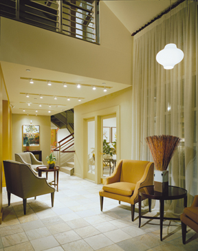
This building had a very utilitarian entry. The front doors led to a bulky stair that connected to the balcony you see at the top of the image. As part of the renovation, the plan involved relocating the stair to a central location in the building, which opens up the front space as a double height entry foyer.
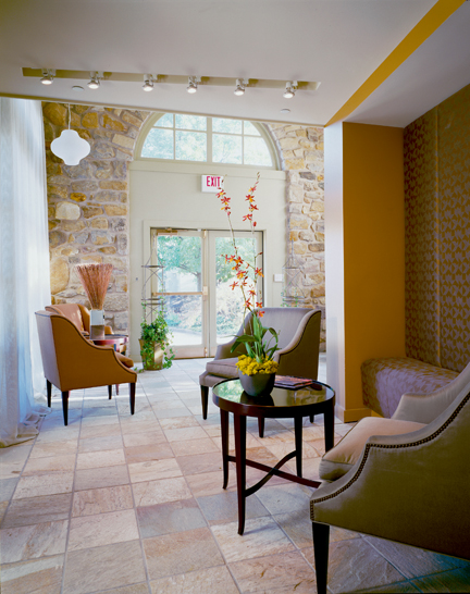
The stone walls created the context from which the color scheme was created. With this, we created a connection to the existing building, while working within a decidedly contemporary aesthetic. I showed this image during an interview for a new project and was asked if this is a boutique hotel. I smiled.
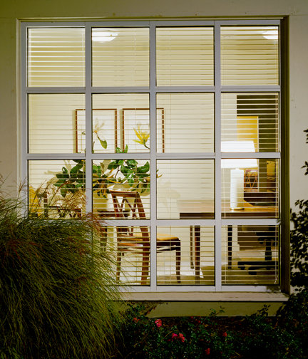
In this kind of project, part of our job is creating an image of a lifestyle. The front office, therefore, “feels like home.”
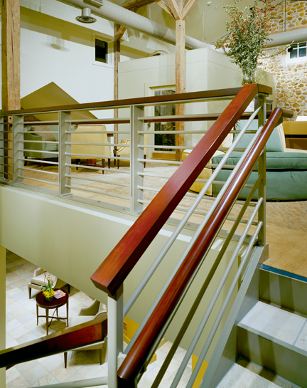
This image shows visual continuity between the lower and upper levels. The goal was to make a clear delineation of “old” and “new,” in a comfortable way.
