How I Did This? Part 2
Written by Ernesto Santalla on August 20th, 2012 // Filed under Uncategorized
The crux of the renovation of the spaces in my 962 sf apartment was the bathroom and closet area, but the rest needed attention to make it all come together.
Kitchen
I love open kitchens, but this example does not fit the profile.
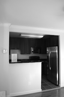
The kitchen was a mismatch of appliances, lighting, cabinetry and flooring shoved in to a small space.
Here’s what I did to it:
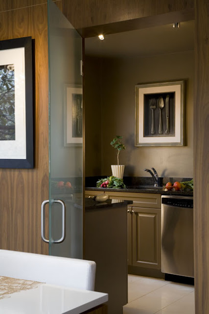
The space was enclosed in the same wood used elsewhere and a frosted glass door was added to close it off entirely when desirable. The cabinets were painted. In fact, everything in that room was painted the same color to give it unity and minimize the contrast between the color of the walls and the black countertops. The upper cabinets were removed.
The Living and Dining areas has great window space, so I took a great asset and made it better.
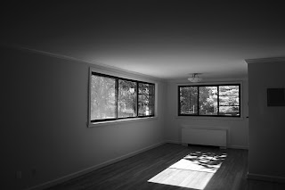
Before
The two window groupings were connected by a thick piece of wood trim. The inside corner was covered with mirror, which gives the sense of it being all glass. Notice the slight drop in the ceiling above the table. It set’s off this area from the Living Room area in the foreground.
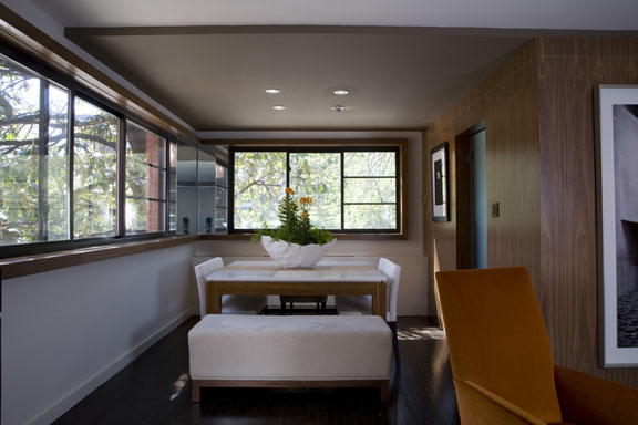
After
The remaining spaces complete the concept.
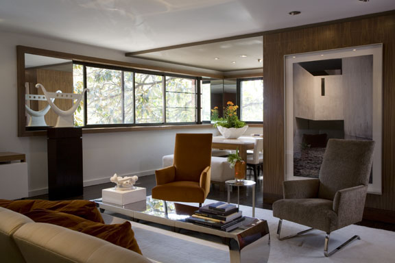
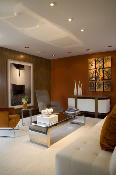
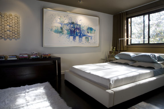
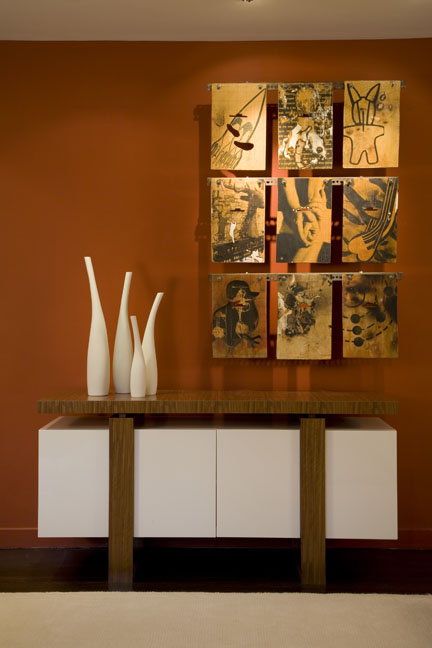
And finally, this image was on the cover of Home and Design magazine.
Conclusion
I purchased this unit because it could be “fixed.” Most of this could have been done when the building was renovated for virtually the same cost. Good design is good business. That the real estate market values this apartment according to a formula dictated by lending institutions is unfortunate. The mortgage industry fell apart because people were allowed to get in way over their heads in homes that were too large for them, not because of design. Quality is sustainable; it starts with good design.
Ciao,
Ernesto
