Thanks For Design

Uncategorized

Being good at anything is hard work; it requires discipline. Reaching for the goal gives purpose, ambition and the drive to succeed. And once a baseline is achieved, you want to get better and that’s where the discipline pays off. I am always designing or thinking about design. And when I’m not doing that, it’s something related, like photography, and in recent years, writing.

I wasn’t always a good designer. When I first started Architecture school I was clueless, fell flat on my face at least a few dozen times, but I’d say by the time I finished school at Cornell University I was pretty good at it. As soon as I started working I then realized I had no clue on how things get built and the thousands of technical issues that arise out of building just about anything. Being good at design opened doors for me, which allowed me to do the “fun” stuff, while I acquired technical proficiency along the way.

Making Art From A WMD

Uncategorized

December 2006 found me at Flamingo Beach in Culebra, Puerto Rico. Shaped like a horseshoe, it has crystal clear, shallow water that gradually turns emerald green and turquoise; silky white sand, palm trees swaying in the warm breeze, and in the near distance, verdant hills. There is but one small building and a few cabanas on this beach, the small compound I was staying.
Right after sunrise the sound of the ocean is barely a whisper and the sand is wet with dew. As the sun climbs the sky, the water comes alive with color and the sand warms to the touch. The afternoons are best spent out of the intense sun and heat, but come sunset, the sky darkens until the stars emerge to illuminate the boundless sky.
The days in Culebra were some of the most peaceful, serene and even spiritual of my life. At this place of ineffable beauty, nature and man coexist in perfect synchronicity. Flamingo Beach has a soul.
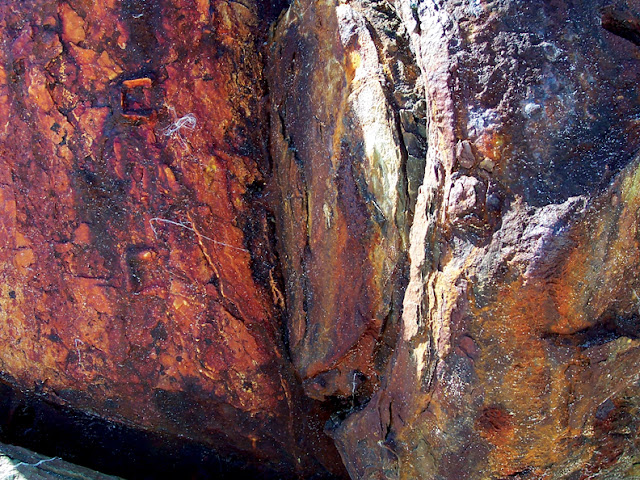
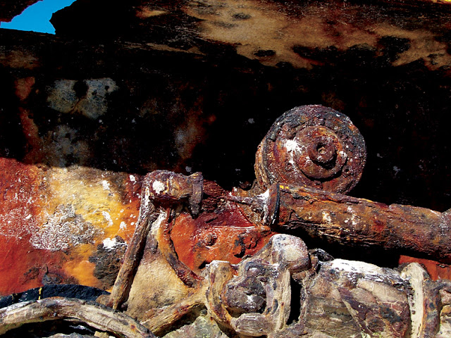
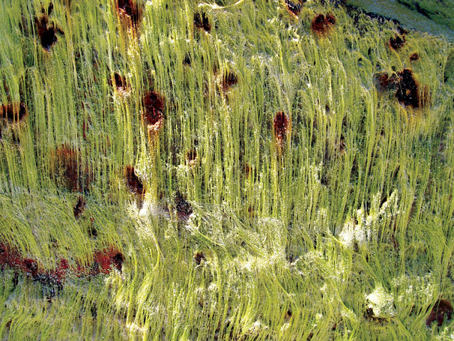
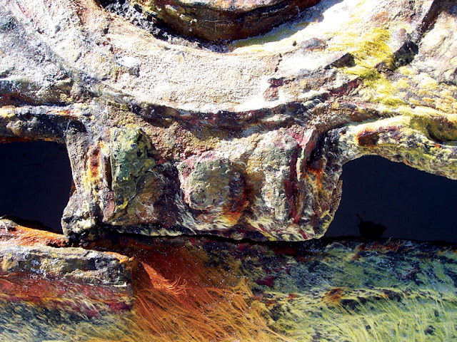
Little effort is required to go from one end of the beach to the other, so I took leisurely strolls along the gentle surf. At one end, two antiquated artillery tanks sit abandoned to the elements and left to rot. The surface of the oxidized tanks is painted with vibrantly colored graphics, as if graffiti. At turns, it also looks like the art of the Taino Indians, but they are long gone. As unexpected objects in the landscape they are interesting enough, but corrosion mixed with painted symbols and moss growing on them creates fantastic microcosms imbued with life. I cannot imagine the beach without the tanks, however incongruent at first glance. They have become part of the soul of the place.
Graffiti and ocean water have transformed this old tank into a piece of art.  Photo by Ernesto Santalla.


Graffiti and ocean water have transformed this old tank into a piece of art.  Photo by Ernesto Santalla.

This was the first time I worked with a digital camera, thanks to the fact that one of my friends had one handy. It’s been my goal with color photography to take abstract images, which is not an easy task, but then again, that’s where the satisfaction comes.

Like Ernesto Santalla Photography on Facebook
Follow me on Twitter

November 13th, 2012

For Green’s Sake, Part 2

Uncategorized

As we start to recover from the physical and emotional devastation of Hurricane Sandy, solutions emerge. There is the immediate need for food and shelter and there is a call to action for preparedness in the future. Being ready for a possible eventuality comes in many ways; one of them is awareness. What are the environmental ramifications of our choices, for example? We can act with conscience and the desire to protect the environment.

Change starts at home and it’s the efforts of many individuals that amount to significant change over time. Much has done for the sake of progress and innovation and in the process, the environment is ransacked and neglected. With awareness comes change, which is at the core of sustainability.

In 2009, I was part of a group of people in the construction industry-a developer, a contractor, architects, engineers, interior designers and community leaders, who realize changes at home are necessary. As such, we created the GreenHouse, a work of architecture, engineering and interior designers who embraced the need to lead in a sustainable direction of environmental responsibility.

In “For Green’s Sake, Part 1,” I discussed the design of the Spa/Retreat designed by Studio Santalla. Let’s look at the results.

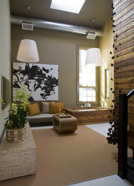
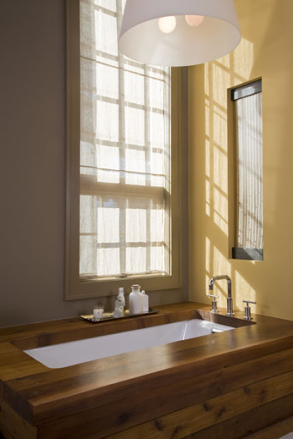
Economy of means is at the core of sustainability. How can the the minimum achieve the maximum? During the day, natural light is used to the maximum, for example. Did I mention it’s free?

Studio Santalla designed this home spa with sustainable and environmentally friendly materials
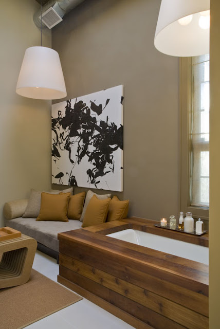
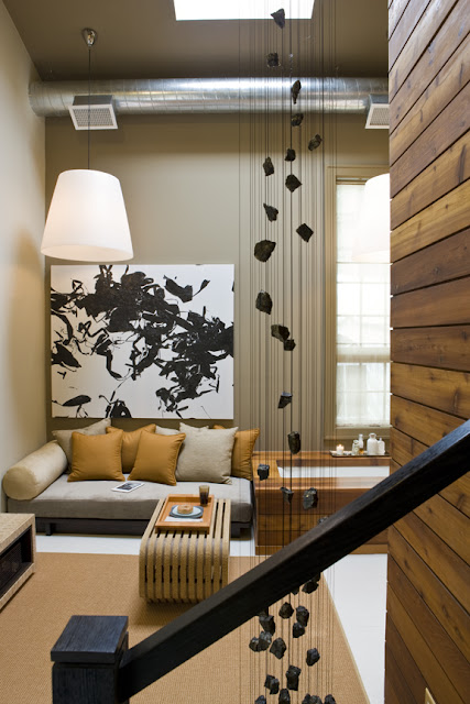
The daybed is perfect for naps. Fabrics by Brentano and Joseph Noble. The daybed structure was fabricated by Superior Home Services. “Untitled,” made from plastic bags heat welded on to plastic wrap is by Dan Steinhilber, represented by G Fine Arts. Low VOC paint is by Farrow and Ball.
A sustainable, green home spa designed by Washington, DC architecture firm Studio Santalla

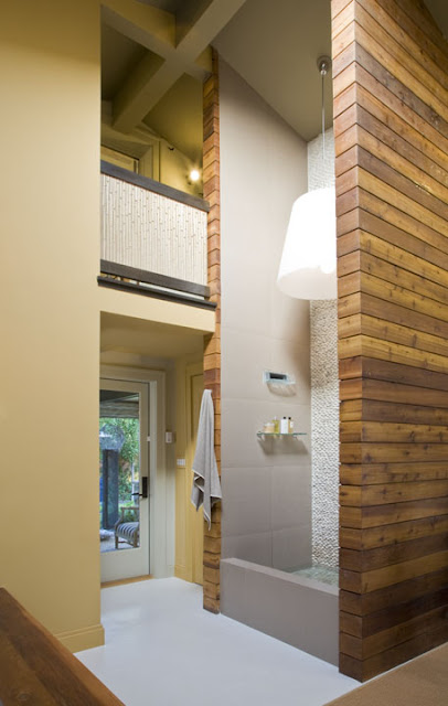
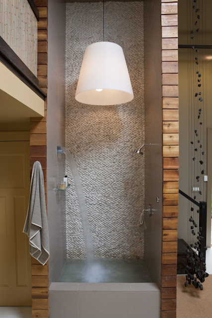
The tall curb contains the water for the re-circulating waterfall fixture by Kohler, which has been unfortunately discontinued. And yes, the light fixture by Fontana Arte inside the shower meets code. It’s above the minimum height required.

The balcony guard rail by 3Form is made from recycled plastic.

Ceramic floors and wall tiles, supplied by Architectural Ceramics are durable and require minimum maintenance.

Sustainable cedar wood surrounds the two-story shower in this eco-friendly home spa designed by Washington, DC architect Ernesto Santalla
The recycled plastic by 3Form is used again to cover an opening created to bring in natural light to the powder room beyond.
A sustainable cedar tub surround is a highlight of this eco-friendly home spa designed by Washington DC architecture and interior design firm Studio Santalla

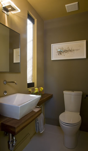
The Powder Room has water efficient fixtures by Kohler, a cedar slab countertop, a piece of art made from junk mail, You Meet Certain Criteria, by Aurora Robson, represented by Project 4, and towels made from unbleached Irish linen.

A cedar vanity and vessel sink complete this sustainable home spa by Washington, DC architecture and interior design firm Studio Santalla

A simple stair rail leads to the second floor office space. The hanging piece is “Danae” by Barbara Josephs Liotta.

Sustainable art completes this eco-friendly home spa by Washington, DC architect and interior design firm Studio Santalla
The recirculating waterfall enhances the spa experience, as does the river rock back of the shower.
River rock and a two-story shower finish this sustainable home-spa by Washington, DC architect and interior design firm Studio Santalla

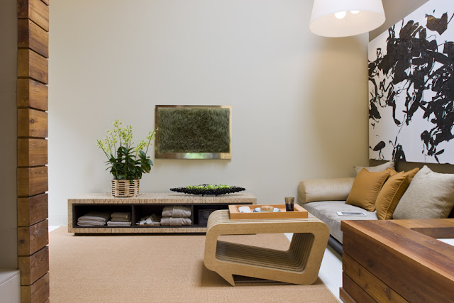
The coffee table, made from corrugated cardboard is by Leo Kempf. “Grassland” is a commentary on grass as a a “foreign” object. The credenza, designed by Studio Santalla is made of Kirei, a recycled wood product and Paper Stone; built by Wooden Design.

Sustainable furniture was custom designed for this eco-friendly home spa by Washington, DC architect Ernesto Santalla
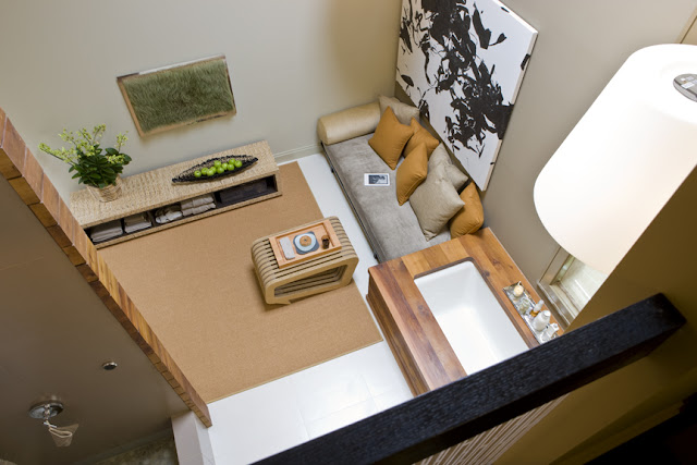
The view from above. A second generation Kindle, now older than a dinosaur is on the daybed. It was the “it” electronic until the iPad came out a few months later. Regardless, I’ve read eBooks since that time. The sisal carpet is by Merida.
Studio Santalla designed this sustainable home spa outside of Washington, DC.
A documentary on the architectural, interior design and construction of the GreenHouse was made by Green Living Films and premiered at the 2010 Washington, DC Environmental Film Festival, in which I had the good fortune to participate.
The Spa/Retreat received lots and lots of press, including the Washington Post, Traditional Home and a feature in Home & Design Magazine. Washington Life magazine also recognized me as one of DC’s top design professionals. I suppose you can call these a subset of benefits of “going green.”
Thanks for reading and remember
Like Studio Santalla on Facebook
and Follow @Studio_Santalla on Twitter
November 5th, 2012

For Green’s Sake, Part 1

Uncategorized

Grass isn’t Green; as in it’s not environmentally friendly. It requires constant irrigation, maintenance and as a landscape material, it does not help retain rain water, which can be used for purposes where potable water is typically employed.

I haven’t heard anyone dispute the above statement, but as the discussion on Sustainability rages on, the solutions to undo the damage we’ve inflicted on the earth become increasingly complex and debated.

It’s interesting that the USGBC, United States Green Building Council, one of the top entities to set guidelines for sustainability has set standards for just about everything except residential interiors. Yes, there is a lot of guidelines that cross over from other areas, but you can build a home that achieves and even surpasses the criteria and achieve certification according to the LEED rating system, but fill it with toxic items that may affect the health and wellbeing of the occupants.

In 2009, this issue was addressed by a group of interior designers and one architect, yours truly. It took the form of a designer showhouse within the context of the first Carbon Neutral, single family home built on the East Coast, known as the Greenhouse in McLean, Virginia. At the helm of the project were Mark Lowham of WestGroup as Developer, Mark Turner of Green Spur as General Contractor, Michael Day of Cunningham-Quill Architects as Project Architect and Deanna Belli and Victoria Sabo of CharityWorks. The former Spaces magazine was the media partner.

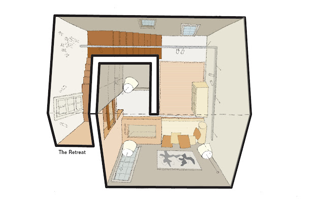
Studio Santalla designed the Spa/Retreat. We were one of 17 firms selected to participate from over 80 entries. As the house was still in construction, we were able to have our hand in shaping the architecture of the space. Here’s a sketch of our final design.

Plan view of the sustainable home spa designed by Washington, DC architecture and interior design firm Studio Santalla

The space serves as a pool house, office and outdoor covered patio and has a separate entrance.

The Spa/Retreat is organized around the shower, a two-story shaft at the center of the space, clad in cedar. Water is the source of life, and wood represents growth and renewable resources. The perimeter of the space is occupied by a relaxation area with and a soaking tub. A wood stair wraps around the wood shaft to the office space on the upper level, designed by Skip Sroka of Sroka Design. To allow natural light to the upstairs, we added a balcony outside the office and by reducing the overall amount of wall originally planned for the space, a larger skylight could be installed. At the backside of the Retreat is the    covered patio, designed by Dee Thornton of Houseworks Interiors.

The space under construction:

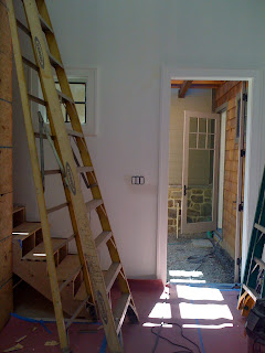
The entry from the main house

Construction photo of eco-friendly home spa by Studio Santalla
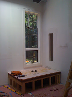
Framing for the soaking tub
Construction photo of the platform for the soaking tub
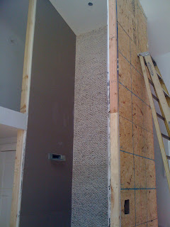
The shower. The back wall is river rock.
Construction photo of the two story shower by Studio Santalla
A month or so later
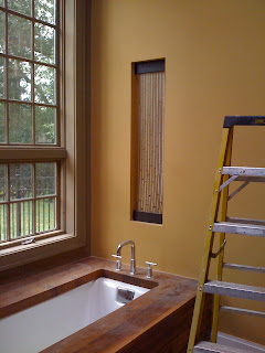
Paint, finishes, plumbing. The “window” is to the powder room behind the wall
Finished construction photo of the soaking tub by Studio Santalla
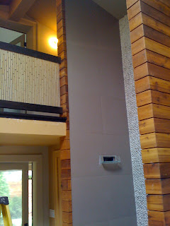
The shower is complete.
Finished construction photo of two story shower by Studio Santalla
The pendant lights are installed, the ceramic floors are uncovered and the furnishings start arriving.
Green home spa by Studio Santalla

Up next: the results.

Give Studio Santalla a “like” on Facebook
Connect with Ernesto Santalla on Linkedin

October 29th, 2012

Classical, Modern, Deconstruction and Toasted

Uncategorized

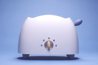
While the ongoing debate on what constitutes good design will ensue until the day humans no longer play a part of it, I’d like to state a premise: taste and good design are not mutually exclusive. There is some really good design I don’t care for, but that doesn’t take away from it’s merit. I’ll use architect Michael Graves‘ household artifacts for Target as an example. They are well designed; just not for me. He’s also an excellent architect, whose work I admire, but mostly don’t like.

Michael Graves Toaster for Target
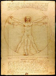
Ancient roman architect, engineer and writer Vitruvius, in his treatise  “The Ten Books of Architecture” explains a structure must exhibit the three qualities of firmitas, utilitas, venustas-meaning it must be solid, useful, beautiful.  According to Vitruvius, architecture imitates nature. Humans create their shelter using natural materials. The Greeks perfected the art of building and in doing so invented the architectural orders: Doric, Ionic and Corinthian, upon which all buildings are proportioned. The Vitruvian Man, as later drawn by Leonardo da Vinci, embodies the fundamental geometric patterns of the universe, the square within the circle. Currently, the Design Quality Indicator, a system started in England used to rate buildings, is rooted in Vitruvian principles.
Vitruvian Man by Leonardo da Vinci
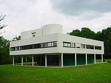
Fast forward to the Industrial Revolution and the accompanying breakthroughs in manufacturing, transportation and building technology, resulting in an apparent break with tradition in the form of what is commonly referred to as the Modern Movement in Architecture. Twentieth century architect, Le Corbusier, in his manifesto, “Towards An Architecture,” defined a fundamental shift in how we would interact with buildings, arising from a new architecture based on function and an aesthetic based on pure form. Over a hundred years later, part of our daily bread, these ideas aren’t radical anymore. In fact, there is a lot of in common between Le Corbusier and Vitruvius.
Villa Savoie by Le Corbusier
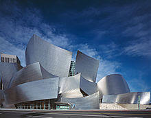
The digital age has made the unthinkable constructible. Enter Frank Gehry, whose work defies modernism, structure, our notions of space and redefine what is good, to say the least of what we like. At first, I thought of his work as junkyards, but am now a convert to his deconstructed buildings.
Gehry and Partners' Disney Concert Hall
Gehry and Partners’ Disney Concert Hall
Vitruvius substantiated and inspired architects during the Renaissance. Le Corbusier said he applied the same principles to everything he designed as does Michael Graves. Frank Gehry’s work has redefined the profession. These are masters of Design. Their work sets the bar for good design.
I don’t think Target will be asking Gehry to design a titanium toaster, but maybe Lady Gaga needs some new wardrobe ideas.
Studio Santalla is on Facebook, Linkedin, Houzz and Pinterest

October 15th, 2012

Studio Santalla And The Academy Awards

Uncategorized

I feel very close to an Academy Award. My one degree of separation is through author and screen writer  Larry McMurtry. Studio Santalla’s office occupies the space his bookstore, BookedUp, previously occupied in Washington, DC. Over the years I’ve found a number of documents left behind including an Emmy nomination certificate and a handwritten note penned by E. M. Forster.

Delusions of grandeur aside, I’m fortunate to have a great space, which is home to our office. Located on one of the busiest and also loudest intersections in Georgetown, it is an oasis of calm and comfort.

It was empty of books at the time of my first visit, but I immediately identified it as the place for our new office. Rather dark, dingy and musty, it needed to be revamped as an office space for an architectural and interior design studio.

Studio Santalla Before
Entry
Studio Santalla Before
Main Space
Studio Santalla Before
View towards front windows facing M Street with a symmetrical arrangement of bookcases
Studio Santalla Before
The light is coming from windows facing 31 Street
Studio Santalla Before
Open joist ceiling detail
Here’s what we did with this space
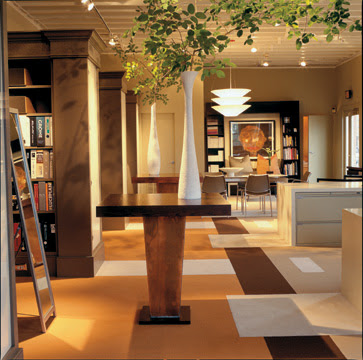
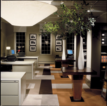
Office of architecture and interior design firm Studio Santalla in Georgetown, Washington, DC
We removed half of the bookcases to make way for desk space on the right. We also removed the bookcases in the entry. We kept the rest of the bookcases, which are now our resource library. We reused furniture from our former office and created an entry space. The table in the foreground, made using planters from the former Smith and Hawkens, are used as “project tables” for samples and literature pulled from the library. The carpet pattern, which looks very custom, is made from the manufacturer’s standard line.
lobby in office of architecture and interior design firm Studio Santalla in Georgetown, Washington, DC
A vignette of the entry. The bench was designed by Studio Santalla
conference area in office of architecture and interior design firm Studio Santalla in Georgetown, Washington, DC
Another detail of the entry. The credenza in the background was also designed by Studio Santalla
Office of architecture and interior design firm Studio Santalla in Georgetown, Washington, DC
What a difference the right color makes! The ceiling, painted a shade of white brightens up the space. Only the monitor in the background gives away the age of this space. We put doors on the end bookcase and are now used for storage. The material is back-painted plexiglass, held in place with velcro, making it a big bang for small bucks effect.
Office of architecture and interior design firm Studio Santalla in Georgetown, Washington, DC
The office at night. We used items found at IKEA, Home Depot, very reasonably priced carpet and combined them with good quality office chairs, filing cabinets, repurposed planters and a few custom items, like the desks. Of the many things I enjoy about it is the balance between traditional elements and contemporary;  commercial and residential and how the space is filled with light even on dingy days.
The office has so far served us very well for over ten years and to this day, first time visitors comment on how great a space it is. No Academy Awards yet, but we did win an Award for Excellence in Interior Architecture from the Washington Chapter of the American Institute of Architects. Subsequently, Washington Spaces did a feature article in the magazine.
We are on a campaign to get to 1,000 Facebook “likes” by the end of the year, so please do your part.
You may also want to follow Studio Santalla on Linkedin

October 8th, 2012

Unfrozen In Time

Uncategorized

In 1998 I went to Spain, the birthplace of my grandfather Manuel Santalla. The first city I visited was Barcelona. I immediately fell in love with this city of grand boulevards nestled between the ocean and the mountains.

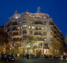
Through my architectural history courses I was well acquainted with the work of Antoni Gaudí, the city’s architect poster child. Initially his work made me and my classmates giggle and considered the buildings bizarre, unattractive and quite frankly, ugly. Soon, however, we understood that in reality Gaudí was a genius, whose mastery of space, form, structure, surface and light rightfully earned him a rightful place in the architectural Pantheon.

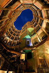
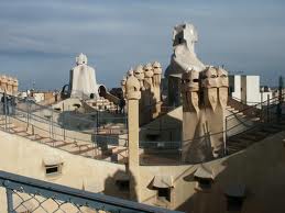
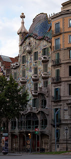
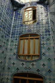
The Casa Batlló and the Casa Milà were located within steps of my hotel on the Passeig de Gràcia. They are exquisitely preserved. Casa Battló is a private building, so I snuck in and got to see the courtyard, adorned with ceramic tiles creating a gradation from white to the deepest of blues as it rises to meet the sky. Parts of the Casa Milà are open to the public, including a roof terrace where all the flues and otherwise visual nuisances are architecturally integrated to become a magical landscape.

Here are some images, courtesy of Wikipedia and various other internet sources, of the Casa Milà.

Casa Mila
Exterior
Casa Mila
Atrium
Casa Mila
Roof Terrace
And the Casa Battló, which makes me swoon.
 Casa Mila
Façade
Casa Mila
Courtyard
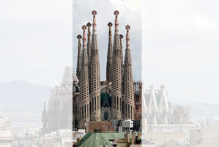
Then there is the subject of Gaudí’s masterpiece, La Sagrada Familia (Basilica i Temple Expiatori de la Sagrada Familia,) which remained unfinished at the time of his death in 1926. The image I saw over and over again in the textbooks of the time was engraved in my memory. I was unaware that construction had resumed and upon arrival, I was taken aback to find there had been more building of this building.
Sagrada Familia
My text book photos showed the facade; the center section of the photo. None of the naves had been built. This photo was taken in 2009, which shows even more than what I saw.
Shock soon became elation. This building had been unfrozen in time and it would not remain a relic, but someday it will be completed. Maybe even in my lifetime, which is another reason to live to 105.
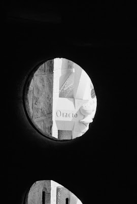
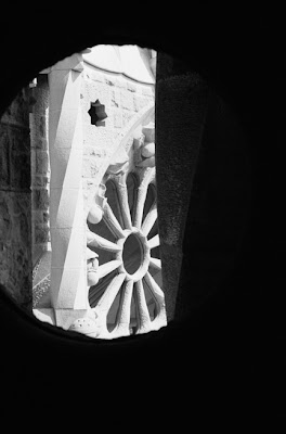
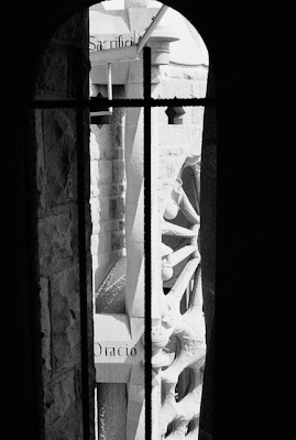
Tourists were allowed access to parts of the basilica, including one of the towers. As I ascended to architectural heaven, I captured these images.
Image of the Sagrada Familia by Ernesto Santalla Photography
Barcelona is still one of my favorite cities. I will go back some day and be awed again by this magnificent work of Art and Architecture. I’ll take my camera and see what happens.
You know the drill.
Like Ernesto Santalla Photography on Facebook
Follow me on Twitter
Clicks encouraged.

October 1st, 2012

Design In Retrograde

Uncategorized

When I moved to DC in 1984, we were in the throes of Post-Modernism. We had rediscovered classical architecture and had once again started adorning our buildings with columns, pilasters, cornices, acroteria and palmettes. We shunned Modern Architecture for all the damage it had inflicted on the quality of our lives and the planning of our cities and thought this Re-Renaissance would provide the answers. Those at the forefront of the movement reinterpreted classicism, making bold expressionistic statements. As most everyone, I was exhilarated by what was going on in architecture and poured over my books looking for sources of inspiration in antiquity.
Luckily, it was a fad, a hiccup in the careers of those who were caught by the frenzy. I still think some of the work I did during this period is good and I’m happy to share it.
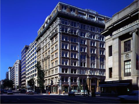
The building in question is The Colorado Building, located at the corner of 14th and G Streets in downtown DC. I worked on this project while employed at KressCox Associates.
Ernesto worked on the Colorado building in Washington, DC while with KressCox Associates
Built in 1903, the building was in bad shape and needed a major interior renovation and restoration of the façade. The ground floor level bay windows were fully restored according to archived drawings, which we were fortunate to find. The most exciting part for me was the two-story roof top addition, designed in such a way that complemented the existing structure. As to how these types of additions should be done, if at all, is still a controversial subject.
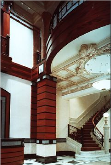
The Lobby was re-envisioned as an extension of the exterior, with fine woods, stones and metals. An existing marble staircase and plaster ceiling were restored.

Commercial interior of Colorado Building in Washington, DC designed by Ernesto Santalla while with KressCox Associates

Once the major renovation and restoration work was completed, the firm was engaged to design a number of the office spaces, which became my foray into the world of commercial interiors.
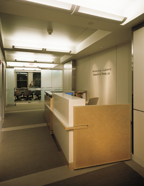
My favorite space was designed for the international law firm WEMED. The client told me the building gave them “establishment,” so he wanted a contemporary interior, and I was happy to oblige.
Contemporary law firm interior by Studio Santalla in Washington, DC

This image is from a 1999 renovation done when I was at Forma Design, Inc., which retained much of the original design, such as the wood paneling, the frosted glass, furniture, etc.
Here’s another view of that space.
Contemporary law firm interior by Studio Santalla in Washington, DC

I think the WEMED space, originally designed in 1990 still looks great, while the 1988 Lobby, makes me cringe. I’d be happy to “repent” for past indiscretions, however, and redesign the Lobby and do something which focuses on the quality of the space and incorporates the items from the original design, which were found during the renovation, as opposed to focusing on surface decoration attempting to make them blend in.
Post-Modernism was a short-lived. A lot of exciting and innovative work has been produced in Washington, DC since then, I am happy to say.
For more information on Studio Santalla, visit our website at www.studiosantalla.com
Like us on Facebook
Follow us on Twitter

September 4th, 2012
Design For Art or Art For Design?
Uncategorized

A few summers ago, I received a call from Drew Porterfield,  Gallery Director at Long View Gallery in Washington, DC to invite me to participate in an upcoming show. “Informed Design” was an illustration of how art and design relate. I was immediately drawn to the project and accepted the invitation.

This project became a vehicle to illustrate in a vignette how all the elements that go in to a design contribute to the whole and how it all comes together is as important as any of the components.

I started by considering the space and the parameters. I limited my “interventions” to three surfaces-two walls and the floor. Being a temporary exhibit, I could not make permanent changes to the space, so one of the themes I worked with was weightlessness. The design revolves around two pieces of art, which were created for the exhibit. I used the back wall of the gallery as a backdrop to a hanging sculpture by Barbara Josephs Liotta. In contrast to the serenity and quietude of this piece, Ralph Turturro painted a series of canvases that when combined, measure almost thirty feet long. The floor completes the composition, using pattern to emphasize the movement through the gallery and give the space subtle definition.

I think it’s time to show pictures.
First, the gallery space as seen from outside.

Barbara Josephs Liotta’s piece “Cleia” is set off by the shape and color of the wall behind it, which I was allowed to paint. Upon entering the gallery, the eye was immediately drawn to this piece. In the foreground a wood bench I designed for the exhibit, which the critic who reviewed the exhibit loved for its “reptilian qualities.”


Ralph Turturro’s “Genesis” hovers in front of the structural column, which is also part of the composition. What looks like the shadow of the bench is actually a different carpet color. It visually anchors the bench in the space as well as being another compositional element.
A long shelf completes the composition at the front of the gallery. Sidra Forman created the floral concept consisting of air plants, which are beautiful and lasted well beyond the time the show was taken down and required zero maintenance.
A view of the gallery as seen when leaving the space. If my work is all about how everything comes together, the goal is to make it look effortless.
I want to give thanks where thanks are due and this project was possible because of
Barbara Josephs Liotta, www.barbaraliotta.com
Brogan Wood Products LLC,  www.broganwoodproducts.com (wood veneers)
Potomac Woodworking, www.potomacwoodwork.net
Sidra Forman, www.sidraforman.com
J+J Invision, http://www.jj-invision.com (carpet tile)
and of course, Long View Gallery, www.longviewgallerydc.com
Finally, I was honored to do this exhibit in conjunction with David Jameson, whose work is outstanding. www.davidjamesonarchitect.com
This exhibit created future opportunities for me, but more on that later. Happy hump day, formerly known as Wednesday!

August 22nd, 2012