What did I do to the “functional” bathroom, closet and corridor area of my apartment? I took it out and started over.
Here’s an analysis of the “before.”
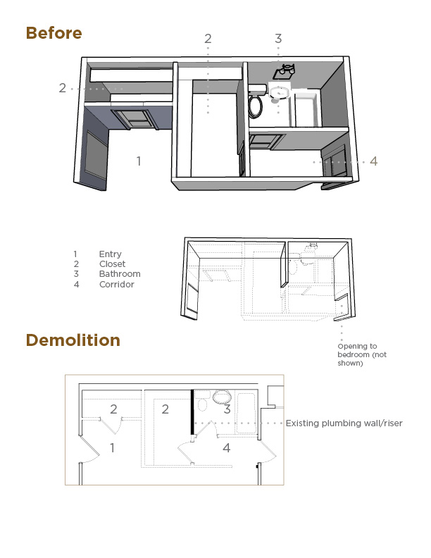
The only thing left standing in the area was the plumbing wall adjacent to the commode. It contained pipes that are common building elements, which could not be moved. The rest of the walls came down in what seemed a matter of minutes.
This is the design that was built.
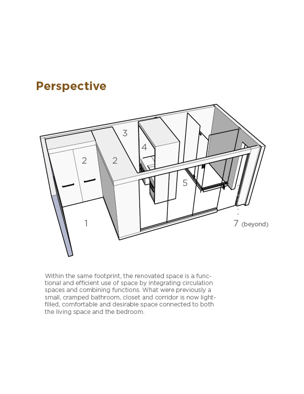
1Entry
2Millwork (cabinetry) Closet
3Dressing Area
4Vanity
5Shower & WC
6Frosted glass
7Bedroom
I will be the first to tell you I called in as many favors as I could to get the best quality materials for the least amount of money possible. The point is it could have been done using less expensive materials and finishes to fit the developer’s budget. I come across this situation time and time again, where the starting point is fixing inherent design flaws for which the consumer paid a premium. So-called amenities are in reality marketing buzzwords, like “crown moulding,” which in DC ranks high on the list alongside “granite countertops” and “stainless steel appliances.”
Now for the pictures of the finished space.
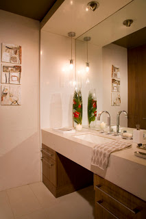
Goodbye small pedestal sink, hello comfort and function-appropriate lighting.
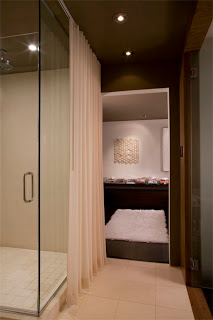
A view from the bathroom to the bedroom. You can catch a glimpse of the glass wall separating this area from the Living Room on the right. Since I was going to live there alone, I removed door in to the bedroom.
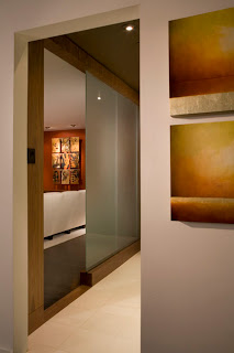
This image is taken in the bedroom looking out towards the Living Room. Notice how the frosted glass wall gives total privacy but still allows for filtered light in to this area. The door is open in this image and in the one below.
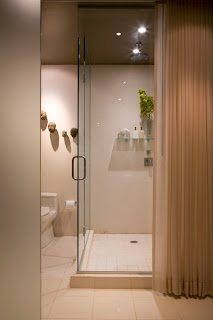
By moving the sink, I was able to make a very large shower. The drape covers the area when not in use gives additional privacy when needed.
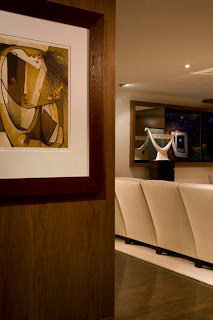
The paneling is the back side of the closet cabinet and is the backdrop to a Botello lithograph.
I’m convinced higher standards of design can be brought to the residential construction market, where it’s kept low on purpose. Think of all of the other products and services we come across where design and engineering are indicative of standards of excellence, light the automobile industry and electronics. The fashion industry has probably done it best, where it’s possible to be fashionable at any price point.
Sustainability starts with good design. In this day, “less is more” has a new meaning. Live better with less, but for that, a shift in the mentality to favor quality over quantity is required.
Next, I’ll show you the rest of the apartment.
