Classical, Modern, Deconstruction and Toasted

Uncategorized

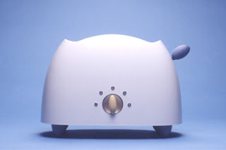
While the ongoing debate on what constitutes good design will ensue until the day humans no longer play a part of it, I’d like to state a premise: taste and good design are not mutually exclusive. There is some really good design I don’t care for, but that doesn’t take away from it’s merit. I’ll use architect Michael Graves‘ household artifacts for Target as an example. They are well designed; just not for me. He’s also an excellent architect, whose work I admire, but mostly don’t like.

Michael Graves Toaster for Target
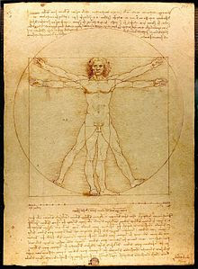
Ancient roman architect, engineer and writer Vitruvius, in his treatise  “The Ten Books of Architecture” explains a structure must exhibit the three qualities of firmitas, utilitas, venustas-meaning it must be solid, useful, beautiful.  According to Vitruvius, architecture imitates nature. Humans create their shelter using natural materials. The Greeks perfected the art of building and in doing so invented the architectural orders: Doric, Ionic and Corinthian, upon which all buildings are proportioned. The Vitruvian Man, as later drawn by Leonardo da Vinci, embodies the fundamental geometric patterns of the universe, the square within the circle. Currently, the Design Quality Indicator, a system started in England used to rate buildings, is rooted in Vitruvian principles.
Vitruvian Man by Leonardo da Vinci
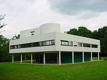
Fast forward to the Industrial Revolution and the accompanying breakthroughs in manufacturing, transportation and building technology, resulting in an apparent break with tradition in the form of what is commonly referred to as the Modern Movement in Architecture. Twentieth century architect, Le Corbusier, in his manifesto, “Towards An Architecture,” defined a fundamental shift in how we would interact with buildings, arising from a new architecture based on function and an aesthetic based on pure form. Over a hundred years later, part of our daily bread, these ideas aren’t radical anymore. In fact, there is a lot of in common between Le Corbusier and Vitruvius.
Villa Savoie by Le Corbusier
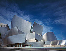
The digital age has made the unthinkable constructible. Enter Frank Gehry, whose work defies modernism, structure, our notions of space and redefine what is good, to say the least of what we like. At first, I thought of his work as junkyards, but am now a convert to his deconstructed buildings.
Gehry and Partners' Disney Concert Hall
Gehry and Partners’ Disney Concert Hall
Vitruvius substantiated and inspired architects during the Renaissance. Le Corbusier said he applied the same principles to everything he designed as does Michael Graves. Frank Gehry’s work has redefined the profession. These are masters of Design. Their work sets the bar for good design.
I don’t think Target will be asking Gehry to design a titanium toaster, but maybe Lady Gaga needs some new wardrobe ideas.
Studio Santalla is on Facebook, Linkedin, Houzz and Pinterest

October 15th, 2012

Studio Santalla And The Academy Awards

Uncategorized

I feel very close to an Academy Award. My one degree of separation is through author and screen writer  Larry McMurtry. Studio Santalla’s office occupies the space his bookstore, BookedUp, previously occupied in Washington, DC. Over the years I’ve found a number of documents left behind including an Emmy nomination certificate and a handwritten note penned by E. M. Forster.

Delusions of grandeur aside, I’m fortunate to have a great space, which is home to our office. Located on one of the busiest and also loudest intersections in Georgetown, it is an oasis of calm and comfort.

It was empty of books at the time of my first visit, but I immediately identified it as the place for our new office. Rather dark, dingy and musty, it needed to be revamped as an office space for an architectural and interior design studio.

Studio Santalla Before
Entry
Studio Santalla Before
Main Space
Studio Santalla Before
View towards front windows facing M Street with a symmetrical arrangement of bookcases
Studio Santalla Before
The light is coming from windows facing 31 Street
Studio Santalla Before
Open joist ceiling detail
Here’s what we did with this space
Office of architecture and interior design firm Studio Santalla in Georgetown, Washington, DC
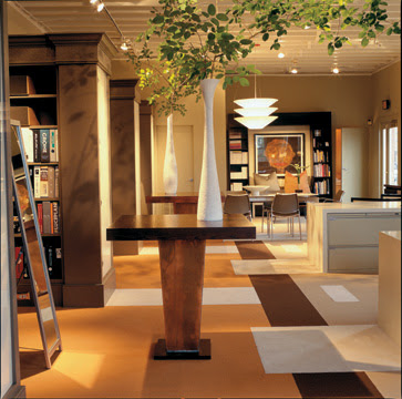
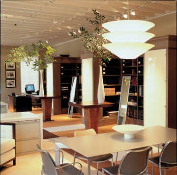
We removed half of the bookcases to make way for desk space on the right. We also removed the bookcases in the entry. We kept the rest of the bookcases, which are now our resource library. We reused furniture from our former office and created an entry space. The table in the foreground, made using planters from the former Smith and Hawkens, are used as “project tables” for samples and literature pulled from the library. The carpet pattern, which looks very custom, is made from the manufacturer’s standard line.
lobby in office of architecture and interior design firm Studio Santalla in Georgetown, Washington, DC
A vignette of the entry. The bench was designed by Studio Santalla
conference area in office of architecture and interior design firm Studio Santalla in Georgetown, Washington, DC
Another detail of the entry. The credenza in the background was also designed by Studio Santalla
Office of architecture and interior design firm Studio Santalla in Georgetown, Washington, DC
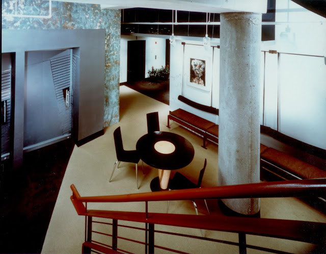
What a difference the right color makes! The ceiling, painted a shade of white brightens up the space. Only the monitor in the background gives away the age of this space. We put doors on the end bookcase and are now used for storage. The material is back-painted plexiglass, held in place with velcro, making it a big bang for small bucks effect.
Office of architecture and interior design firm Studio Santalla in Georgetown, Washington, DC
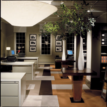
The office at night. We used items found at IKEA, Home Depot, very reasonably priced carpet and combined them with good quality office chairs, filing cabinets, repurposed planters and a few custom items, like the desks. Of the many things I enjoy about it is the balance between traditional elements and contemporary;  commercial and residential and how the space is filled with light even on dingy days.
The office has so far served us very well for over ten years and to this day, first time visitors comment on how great a space it is. No Academy Awards yet, but we did win an Award for Excellence in Interior Architecture from the Washington Chapter of the American Institute of Architects. Subsequently, Washington Spaces did a feature article in the magazine.
We are on a campaign to get to 1,000 Facebook “likes” by the end of the year, so please do your part.
You may also want to follow Studio Santalla on Linkedin
October 8th, 2012

Unfrozen In Time

Uncategorized

In 1998 I went to Spain, the birthplace of my grandfather Manuel Santalla. The first city I visited was Barcelona. I immediately fell in love with this city of grand boulevards nestled between the ocean and the mountains.

Through my architectural history courses I was well acquainted with the work of Antoni Gaudí, the city’s architect poster child. Initially his work made me and my classmates giggle and considered the buildings bizarre, unattractive and quite frankly, ugly. Soon, however, we understood that in reality Gaudí was a genius, whose mastery of space, form, structure, surface and light rightfully earned him a rightful place in the architectural Pantheon.

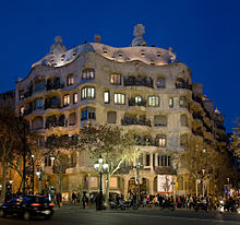
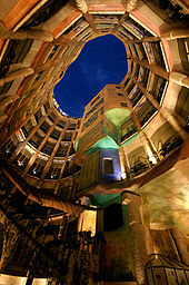
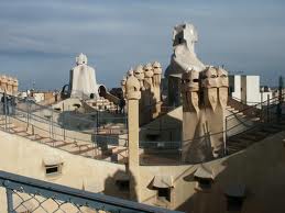
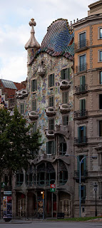
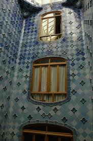
The Casa Batlló and the Casa Milà were located within steps of my hotel on the Passeig de Gràcia. They are exquisitely preserved. Casa Battló is a private building, so I snuck in and got to see the courtyard, adorned with ceramic tiles creating a gradation from white to the deepest of blues as it rises to meet the sky. Parts of the Casa Milà are open to the public, including a roof terrace where all the flues and otherwise visual nuisances are architecturally integrated to become a magical landscape.

Here are some images, courtesy of Wikipedia and various other internet sources, of the Casa Milà.

Casa Mila
Exterior
Casa Mila
Atrium
Casa Mila
Roof Terrace
And the Casa Battló, which makes me swoon.
 Casa Mila
Façade
Casa Mila
Courtyard
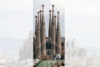
Then there is the subject of Gaudí’s masterpiece, La Sagrada Familia (Basilica i Temple Expiatori de la Sagrada Familia,) which remained unfinished at the time of his death in 1926. The image I saw over and over again in the textbooks of the time was engraved in my memory. I was unaware that construction had resumed and upon arrival, I was taken aback to find there had been more building of this building.
Sagrada Familia
My text book photos showed the facade; the center section of the photo. None of the naves had been built. This photo was taken in 2009, which shows even more than what I saw.
Shock soon became elation. This building had been unfrozen in time and it would not remain a relic, but someday it will be completed. Maybe even in my lifetime, which is another reason to live to 105.
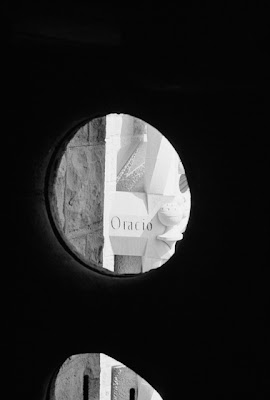
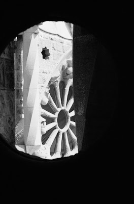
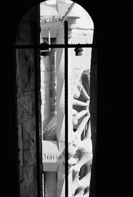
Tourists were allowed access to parts of the basilica, including one of the towers. As I ascended to architectural heaven, I captured these images.
Image of the Sagrada Familia by Ernesto Santalla Photography
Barcelona is still one of my favorite cities. I will go back some day and be awed again by this magnificent work of Art and Architecture. I’ll take my camera and see what happens.
You know the drill.
Like Ernesto Santalla Photography on Facebook
Follow me on Twitter
Clicks encouraged.

October 1st, 2012

Defining Moment

Uncategorized

I’m going to show you a project which was a definitive fork in the road. The client pushed my limits of creativity, patience and empowerment. Nothing was the same after this and set me on the path of making my own way in the Design profession.

The project was for an Ad agency in Baltimore; Doner. To land the project, we had to do a two-part competition, which we won. The design I did was impossible to build, but I didn’t tell anyone. The point was to wow the client and worry about the details later, plus it was something they were never going to build anyway.

The client told us to go all out, to push ourselves to the limit, to reinvent the ad agency. He wanted their clients to come to the office and feel they were walking in to a creative environment. He wanted the creative teams of the agency to stop meeting in offices and work in team areas, so we worked with the idea of Caves and Commons. We made offices purposefully small so people wouldn’t cram in there and made generous spaces where teams could congregate to work on projects.

Just to be clear and not ruffle anyone’s feathers, I designed the original portion of the project while I was an Associate at KressCox Associates PC and then designed an expansion while I was a Principal at Forma Design. You will find these projects on their websites.

Here’s one of the plans. The colors represent different zones within the space.

Commercial floor plan for Doner Advertising in Baltimore, MD , created by architect Ernesto Santalla while at KressCox Associates.
Umpteen years later I still think it’s a great looking graphic.
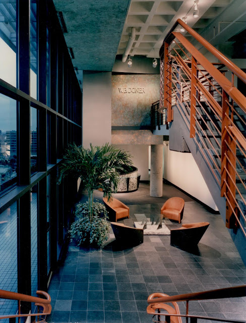
Lobby of the W.E. Doner advertising agency, designed by architect Ernesto Santalla while at KressCox associates in Washington, DC.
The reception’s main feature is the view of the Baltimore Harbor, which inspired shapes, materials and the overall aesthetic of the space. This project was published in Interior Design. It was a way of saying “I’ve arrived.”
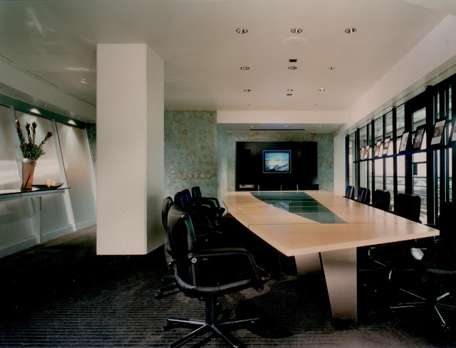
Conference room of W.E. Doner advertising agency with custom table, designed by architect Ernesto Santalla while at KressCox associates
A view of the main presentation room, which came to be known as the “Shark Tank,” a long time before the show of the same name. In face, well before reality shows. I designed the table for the space.
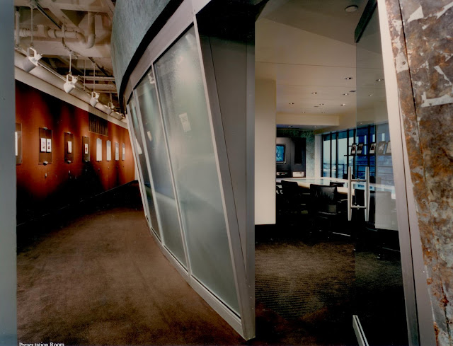
Conference room of W.E. Doner advertising agency with custom table, designed by architect Ernesto Santalla while at KressCox associates
The outside of the Shark Tank. It got it’s nickname not only because of the dealings in the advertising world, but it’s proximity to the Baltimore Aquarium across the street.
Commercial presentation area with custom designed furniture at W.E. Doner advertising agency in Baltimore, MD, designed by Washington, DC architect Ernesto Santalla while at KressCox associates.
Another Presentation Room with an open area. We had a great time designing this space, including custom designed furniture.
Office area of W.E. Doner advertising agency in Baltimore, MD, designed by architect Ernesto Santalla while at KressCox associates
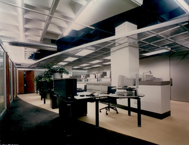
One of the support areas, surrounded by offices. The dropped ceiling is used for more direct lighting of the area. It casts a “shadow” on the ceiling above, which is painted a dark color and obscures mechanical equipment. The shape is again reflected in the carpet pattern. The one thing that gives the age of this space away is the computer. [grin]
Commercial editing room at Baltimore advertising agency W.E.Doner, designed by Washington, DC architect, Ernesto Santalla while at KressCox associates
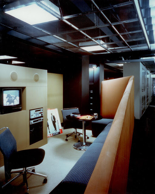
One of the Common Areas. The technology is grossly outdated, but the space remains Oh-So-Cool.
Thanks for reading.

September 26th, 2012

Creative By Choice

Uncategorized

I like to be in the mindset to photograph. My “day job” requires that I be creative on demand, so when looking for a creative outlet, I want to be relaxed. It therefore coincided with vacations that I snapped away. I have a preference for cities over country sides and being an architect, it’s no coincidence I am drawn to architecture.

Much of subjects of my B/W photography are architectural, if not architectural photography, which is a specialty within photography. Black and white film photography requires patience and discipline. The patience is in recognizing that what you are seeing in color may not translate in to a good image in black and white, which is where discipline takes over. The mind needs to compose an image in black and white of a scene you see in color.

I don’t have that many images from the 90’s, either because I haven’t had them digitized or the negatives have been misplaced or damaged.

Here’s one of the survivors.

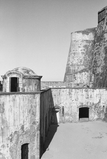
Morro, by Ernesto Santalla Photography
Morro, 1994

I took this image in 1994. I lived in Puerto Rico for twelve years, from 1970 to 1982. My parents stayed on for another 12 years before they moved to Miami. On what was the last visit “home,” I went to Old San Juan and to to El Morro, one of the two major fortifications built by the Spanish, which guarded the city from naval attacks.

“Morro” represents those formative years of my life and an homage to that beautiful country of wonderful people.

Ciao.

Like

September 21st, 2012

Treetops-The Full Results

Uncategorized

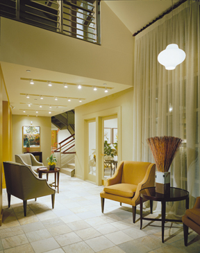
At the end of Treetops Part 1, I left you with this image of a Clubhouse my office redesigned for a residential complex in West Chester, Pennsylvania.
Lobby of clubhouse redesign by architecture and interior design firm Studio Santalla
This building had a very utilitarian entry. The front doors led to a bulky stair that connected to the balcony you see at the top of the image. As part of the renovation, the plan involved relocating the stair to a central location in the building, which opens up the front space as a double height entry foyer.
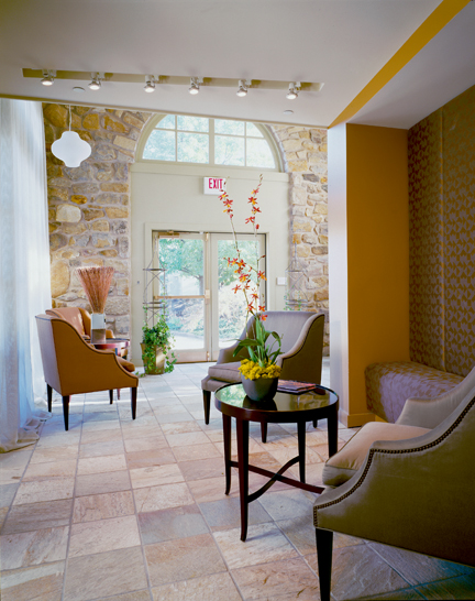
Entry of clubhouse redesign by architecture and interior design firm Studio Santalla
The stone walls created the context from which the color scheme was created. With this, we created a connection to the existing building, while working within a decidedly contemporary aesthetic. I showed this image during an interview for a new project and was asked if this is a boutique hotel. I smiled.
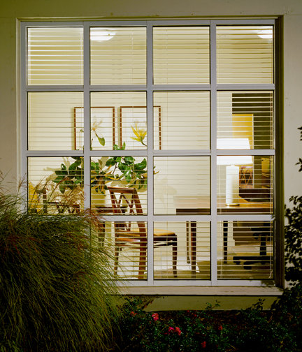
Clubhouse redesign by architecture and interior design firm Studio Santalla
In this kind of project, part of our job is creating an image of a lifestyle. The front office, therefore, “feels like home.”
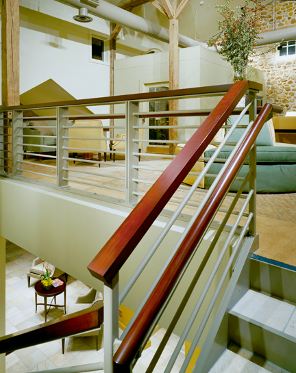
Loft lounge space of clubhouse redesign by architecture and interior design firm Studio Santalla
This image shows visual continuity between the lower and upper levels. The goal was to make a clear delineation of “old” and “new,” in a comfortable way.

September 17th, 2012

Motorcycles, Angels and Dinosaurs

Uncategorized

I recently saw a time lapse video showing the construction of a 30 story hotel tower in 30 days from ground breaking to complete interior fit out. It was impressive and commendable on many fronts, including sustainability. What the video didn’t discuss is how much time it took to design this structure, because to make it work, just about every single item that went into the building was pre-fabricated and arrived on the project site ready to install like life size Legos.

The point is architectural projects take time and are not the indulgence of choice when looking for a dose of the pleasure principle.

To that reality of my profession of choice, I’ve found other creative outlets, which yield instant results, like photography. I first started taking photos with film, which I processed and then printed. In a matter of hours I’d see results; the creative equivalent of one of those energy drinks.

This is one of the first photos I took with my one and only camera, which I now refer to as my pet dinosaur.

Form/Function by Ernesto Santalla Photography
Form/Function
I took this image in Ithaca, New York when I was studying Architecture at Cornell University in 1983.


September 14th, 2012

Design In Retrograde

Uncategorized

When I moved to DC in 1984, we were in the throes of Post-Modernism. We had rediscovered classical architecture and had once again started adorning our buildings with columns, pilasters, cornices, acroteria and palmettes. We shunned Modern Architecture for all the damage it had inflicted on the quality of our lives and the planning of our cities and thought this Re-Renaissance would provide the answers. Those at the forefront of the movement reinterpreted classicism, making bold expressionistic statements. As most everyone, I was exhilarated by what was going on in architecture and poured over my books looking for sources of inspiration in antiquity.
Luckily, it was a fad, a hiccup in the careers of those who were caught by the frenzy. I still think some of the work I did during this period is good and I’m happy to share it.
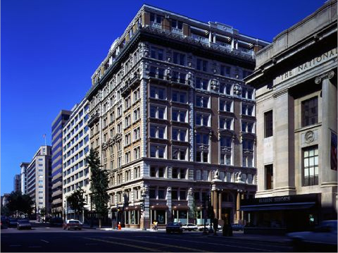
The building in question is The Colorado Building, located at the corner of 14th and G Streets in downtown DC. I worked on this project while employed at KressCox Associates.
Ernesto worked on the Colorado building in Washington, DC while with KressCox Associates
Built in 1903, the building was in bad shape and needed a major interior renovation and restoration of the façade. The ground floor level bay windows were fully restored according to archived drawings, which we were fortunate to find. The most exciting part for me was the two-story roof top addition, designed in such a way that complemented the existing structure. As to how these types of additions should be done, if at all, is still a controversial subject.
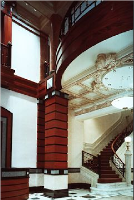
The Lobby was re-envisioned as an extension of the exterior, with fine woods, stones and metals. An existing marble staircase and plaster ceiling were restored.

Commercial interior of Colorado Building in Washington, DC designed by Ernesto Santalla while with KressCox Associates

Once the major renovation and restoration work was completed, the firm was engaged to design a number of the office spaces, which became my foray into the world of commercial interiors.
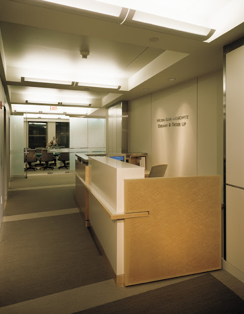
My favorite space was designed for the international law firm WEMED. The client told me the building gave them “establishment,” so he wanted a contemporary interior, and I was happy to oblige.
Contemporary law firm interior by Studio Santalla in Washington, DC

This image is from a 1999 renovation done when I was at Forma Design, Inc., which retained much of the original design, such as the wood paneling, the frosted glass, furniture, etc.
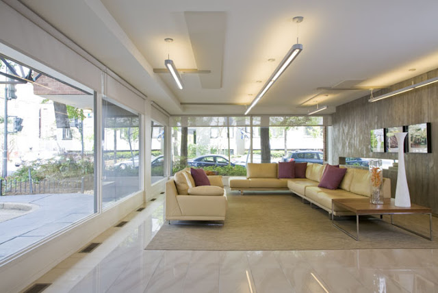
Here’s another view of that space.
Contemporary law firm interior by Studio Santalla in Washington, DC

I think the WEMED space, originally designed in 1990 still looks great, while the 1988 Lobby, makes me cringe. I’d be happy to “repent” for past indiscretions, however, and redesign the Lobby and do something which focuses on the quality of the space and incorporates the items from the original design, which were found during the renovation, as opposed to focusing on surface decoration attempting to make them blend in.
Post-Modernism was a short-lived. A lot of exciting and innovative work has been produced in Washington, DC since then, I am happy to say.
For more information on Studio Santalla, visit our website at www.studiosantalla.com
Like us on Facebook
Follow us on Twitter


September 4th, 2012

Everyone’s A Designer [Part 2: Commercial]

Uncategorized

Part of what gives businesses a competitive edge is design. Where would a brand like Apple be without superior design? Lost in a sea of competitors. Ian Schrager’s hotels always stand out because of design. How do new office buildings justify charging higher rents? Location, amenities and you guessed, state of the art design.

Condominium buildings are commercial buildings for residential use, which means that all the public spaces need to be designed to commercial standards, using the appropriate materials, finishes and furnishings. Every fifteen years or so, design committees are charged with “redecorating.” Sometimes, these committees have good leadership with a clear vision that leads to great results. Here’s one.

BEFORE
From what I gather, a “cozy look” was the direction this condo building in DC took in the 80’s, replete with reproduction antiques.

Before photo of condo lobby features cozy furniture and faux antiques

Would you have known this is a modern era building looking at that photo? Is the purpose of design to take us back in time? Our memory of the past tends to be idealized in my experience.

AFTER

Condo lobby renovation by Studio Santalla in Washington, DC uses tons of natural light.
The amount of natural light in this space at all hours of the day is amazing.
BEFORE
Gold is often associated with prosperity. Here, a wall clad in shiny gold metal added drama? pizazz? a wow factor? If there was one unanimous request from the committee, it was to take it out.
Before photo of condo lobby renovation feature's glitzy gold wall
AFTER
Condo lobby renovation by Studio Santalla in Washington DC has been transformed into a bright and modern space
Welcome to the 21st century and an uncluttered space.
We were asked to renovate a B&B in Flint Hill, Virginia. I told our client I was taking the “country” out of Inn, which he wholeheartedly endorsed.
BEFORE
before photo of renovated bar by Studio Santalla
This space is next to a deck, so we made it in to a Pub. As to what it was before? Some things are best forgotten.
AFTER
Washington, DC architecture firm Studio Santalla redesigned the bar of Flint Hill Public House and Country Inn to achieve a sophisticated, contemporary space
This picture makes me smile every time I see it.
Take a look at the rooms.
BEFORE
Photo of suite at Flint Hill Public house before the transformation by Studio Santalla
The building has great windows and beautiful light. Our job was to get rid of the distractions and capitalize on the assets.
AFTER
Washington, DC architecture firm Studio Santalla transformed the suites of Flint Hill Public House and Country Inn into sophisticated, modern retreats
The rooms are all suites. We solved the “where do we put the TV?” issue by designing a cabinet that swivels, so you can watch from either side of the room. It also helps create two separate areas.
More to come, so stay tuned. Thanks to all of you who have been following the blog.
Ernesto

August 29th, 2012

Page 5 Show More Post5 Posts left