Everyone’s A Designer [Part 1]

Uncategorized

I decided to study architecture when I was 16. It wasn’t the first career choice I considered; at 5, I wanted to be a priest. I started college at 18, graduated 6 after that and it’s been 28 since, so if you are really interested in finding out my age, you can do the math.

One of the things I learned early on in architecture school is we are all designers. Any controlled activity is designed and sometimes changes the course of history, like the way the invention of the flush toilet is linked to the viability of the high rise building. Ok, reinforced concrete was instrumental too.

So if all of us are designers, why the need for a design industry? Notice I didn’t say everyone is a good designer. One of the reasons clients hire my firm, Studio Santalla, is they have something they want changed and we can figure it out for them. So today, I’ll share a few select moments involving a leap, a feat or a coup!

Here’s a project we completed in the early days of Studio Santalla.

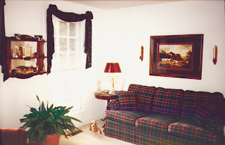
BEFORE

photo of Virginia home before renovation by Studio Santalla

I understand Laura Ashley spent her last days here. Upon her passing, it was time for a change.
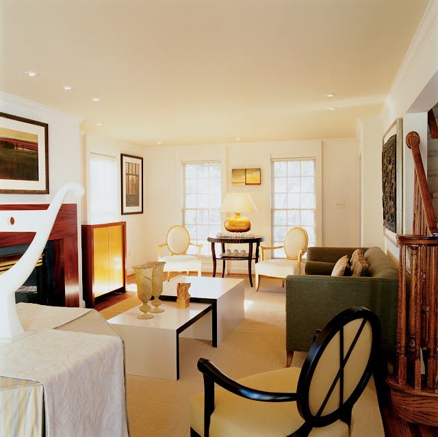
AFTER

Contemporary traditional renovation by Washington, DC architecture and interior design firm Studio Santalla in Northern Virginia.
Another room sported a hunting theme, replete with hound-in-training.
BEFORE
Home office before renovation by Studio Santalla
The new work was partially funded by a yard sale, no joke.
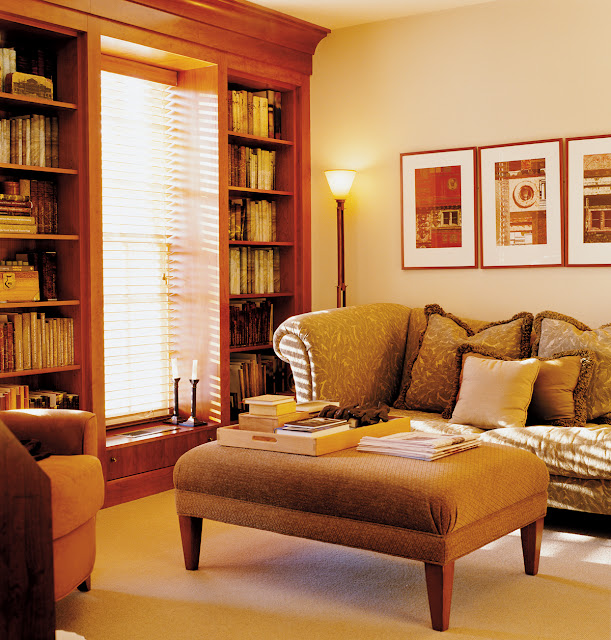
AFTER
Contemporary traditional home library by Washington, DC architecture and interior design firm Studio Santalla in Northern Virginia.
I think there is more “colonial” architecture in DC than Williamsburg. No wonder we are still referred to as “provincial.”
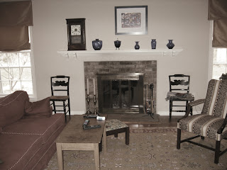
BEFORE
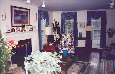
Photo of living room fireplace before renovation by Studio Santalla
Sometimes, it’s about helping people find their inner “design” voice. Whew!
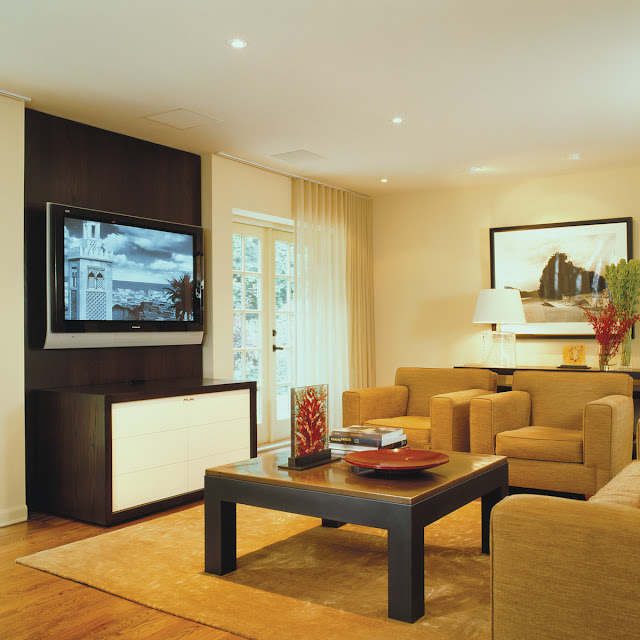
AFTER
Contemporary traditional living room designed by Washington, DC architecture firm Studio Santalla features a built-in media center and modern furniture
Truth be known, the person who designed this workstation intended it in the most temporary, makeshift way, but it makes for a great “before” shot.
BEFORE
home office before renovation by Studio Santalla
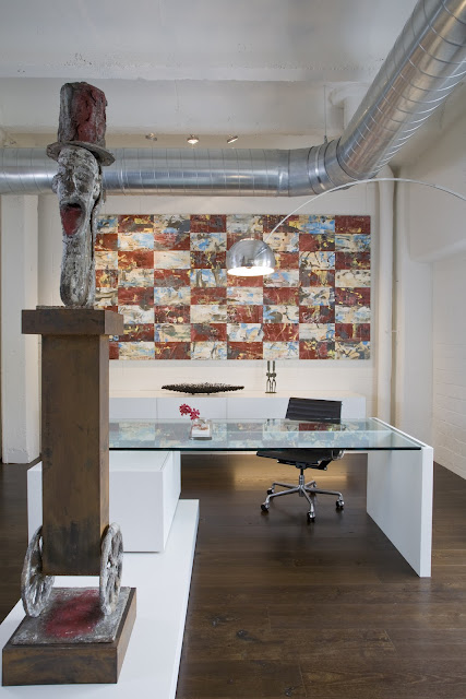
The workspace, redefined as a showplace for art.
AFTER
Modern, luxury home office designed by Washington, DC architect firm Studio Santalla has been transformed into a showcase for contemporary art
Painting by Keith Milow; Sculpture by Nelson Carrilho
I love my job and I’m 52, BTW.
For more information on Studio Santalla, visit www.studiosantalla.com
You can also “like” us on Facebook https://www.facebook.com/studiosantalla
Oh, why not?
Twitter: @Studio_Santalla @ernestosantalla

August 27th, 2012

Design For Art or Art For Design?

Uncategorized

A few summers ago, I received a call from Drew Porterfield,  Gallery Director at Long View Gallery in Washington, DC to invite me to participate in an upcoming show. “Informed Design” was an illustration of how art and design relate. I was immediately drawn to the project and accepted the invitation.

This project became a vehicle to illustrate in a vignette how all the elements that go in to a design contribute to the whole and how it all comes together is as important as any of the components.

I started by considering the space and the parameters. I limited my “interventions” to three surfaces-two walls and the floor. Being a temporary exhibit, I could not make permanent changes to the space, so one of the themes I worked with was weightlessness. The design revolves around two pieces of art, which were created for the exhibit. I used the back wall of the gallery as a backdrop to a hanging sculpture by Barbara Josephs Liotta. In contrast to the serenity and quietude of this piece, Ralph Turturro painted a series of canvases that when combined, measure almost thirty feet long. The floor completes the composition, using pattern to emphasize the movement through the gallery and give the space subtle definition.

I think it’s time to show pictures.
First, the gallery space as seen from outside.

Barbara Josephs Liotta’s piece “Cleia” is set off by the shape and color of the wall behind it, which I was allowed to paint. Upon entering the gallery, the eye was immediately drawn to this piece. In the foreground a wood bench I designed for the exhibit, which the critic who reviewed the exhibit loved for its “reptilian qualities.”


Ralph Turturro’s “Genesis” hovers in front of the structural column, which is also part of the composition. What looks like the shadow of the bench is actually a different carpet color. It visually anchors the bench in the space as well as being another compositional element.
A long shelf completes the composition at the front of the gallery. Sidra Forman created the floral concept consisting of air plants, which are beautiful and lasted well beyond the time the show was taken down and required zero maintenance.
A view of the gallery as seen when leaving the space. If my work is all about how everything comes together, the goal is to make it look effortless.
I want to give thanks where thanks are due and this project was possible because of
Barbara Josephs Liotta, www.barbaraliotta.com
Brogan Wood Products LLC,  www.broganwoodproducts.com (wood veneers)
Potomac Woodworking, www.potomacwoodwork.net
Sidra Forman, www.sidraforman.com
J+J Invision, http://www.jj-invision.com (carpet tile)
and of course, Long View Gallery, www.longviewgallerydc.com
Finally, I was honored to do this exhibit in conjunction with David Jameson, whose work is outstanding. www.davidjamesonarchitect.com
This exhibit created future opportunities for me, but more on that later. Happy hump day, formerly known as Wednesday!
August 22nd, 2012

How I Did This? Part 2

Uncategorized

The crux of the renovation of the spaces in my 962 sf apartment was the bathroom and closet area, but the rest needed attention to make it all come together.

Kitchen
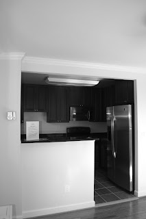
I love open kitchens, but this example does not fit the profile.

The before view of the generic kitchen in Ernesto's Washington, DC apartment.
The kitchen was a mismatch of appliances, lighting, cabinetry and flooring shoved in to a small space.


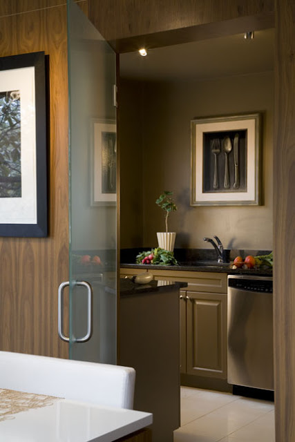
Here’s what I did to it:

A glass door closes the kitchen from the rest of the apartment
The space was enclosed in the same wood used elsewhere and a frosted glass door was added to close it off entirely when desirable. The cabinets were painted. In fact, everything in that room was painted the same color to give it unity and minimize the contrast between the color of the walls and the black countertops. The upper cabinets were removed.
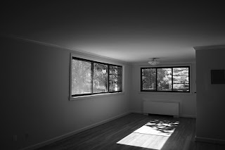
The Living and Dining areas has great window space, so I took a great asset and made it better.
The dining room of Ernesto's apartment before the renovation
Before
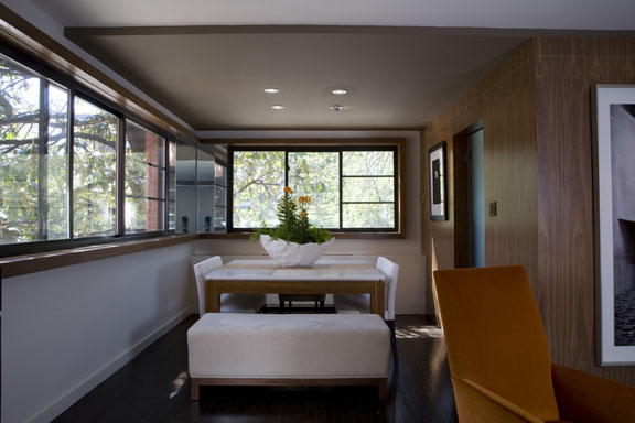
The two window groupings were connected by a thick piece of wood trim. The inside corner was covered with mirror, which gives the sense of it being all glass. Notice the slight drop in the ceiling above the table. It set’s off this area from the Living Room area in the foreground.
Trim and mirror connects the two window groups in the dining room
After
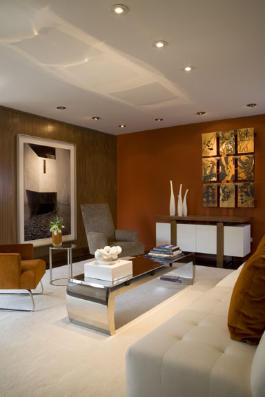
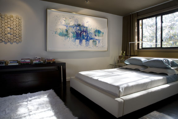
The remaining spaces complete the concept.
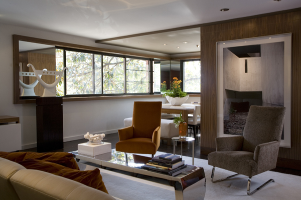
Ernesto's living space post-renovation
Walnut panels and bold colors complete the living space in Ernesto's apartment renovation
Statement artwork is the finishing touch on the bedroom in Ernesto's renovation
And finally, this image was on the cover of Home and Design magazine.
This image of Ernesto's renovation was featured on the cover of Washington Home & Design Magazine
Cover of Home & Design magazine
Conclusion
I purchased this unit because it could be “fixed.” Most of this could have been done when the building was renovated for virtually the same cost. Good design is good business. That the real estate market values this apartment according to a formula dictated by lending institutions is unfortunate. The mortgage industry fell apart because people were allowed to get in way over their heads in homes that were too large for them, not because of design. Quality is sustainable; it starts with good design.
Ciao,
Ernesto

August 20th, 2012

How I did this? (Part 1)

Uncategorized

What did I do to the “functional” bathroom, closet and corridor area of my apartment? I took it  out and started over.

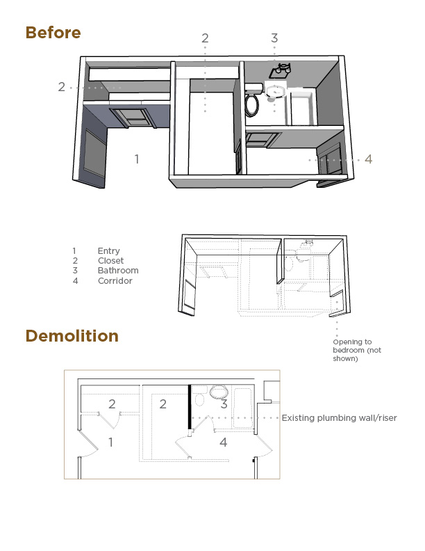
Here’s an analysis of the “before.”

Diagram describing the before view and subsequent demolition of the bathroom area.
The only thing left standing in the area was the plumbing wall adjacent to the commode. It contained pipes that are common building elements, which could not be moved. The rest of the walls came down in what seemed a matter of minutes.
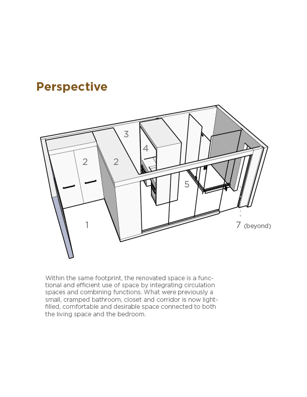
This is the design that was built.
This diagram depicts the design of the renovated bathroom in Ernesto's apartment renovation.
1Entry
2Millwork (cabinetry) Closet
3Dressing Area
4Vanity
5Shower & WC
6Frosted glass
7Bedroom
I will be the first to tell you I called in as many favors as I could to get the best quality materials for the least amount of money possible. The point is it could have been done using less expensive materials and finishes to fit the developer’s budget. I come across this situation time and time again, where the starting point is fixing inherent design flaws for which the consumer paid a premium. So-called amenities are in reality marketing buzzwords, like “crown moulding,” which in DC ranks high on the list alongside “granite countertops” and “stainless steel appliances.”
Now for the pictures of the finished space.
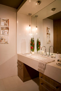
Bathroom vanity designed by Ernesto Santalla during the renovation of his apartment.
Goodbye small pedestal sink, hello comfort and function-appropriate lighting.
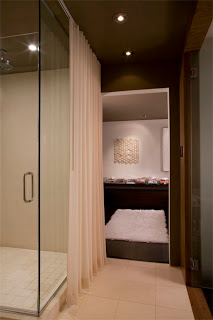
Shower and passage to the bedroom in Ernesto's apartment renovation
A view from the bathroom to the bedroom. You can catch a glimpse of the glass wall separating this area from the Living Room on the right. Since I was going to live there alone, I removed door in to the bedroom.
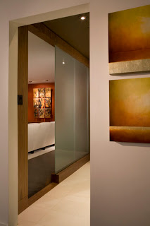
View of the design of the glass wall that allows light to filter to the bathroom
This image is taken in the bedroom looking out towards the Living Room. Notice how the frosted glass wall gives total privacy but still allows for filtered light in to this area. The door is open in this image and in the one below.
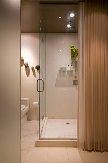
A drapery panel conceals the shower when privacy is needed.
By moving the sink, I was able to make a very large shower. The drape covers the area when not in use gives additional privacy when needed.
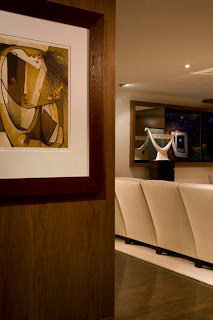
Walnut panels greet entrants to this apartment, renovated by architect and interior designer Ernesto Santalla
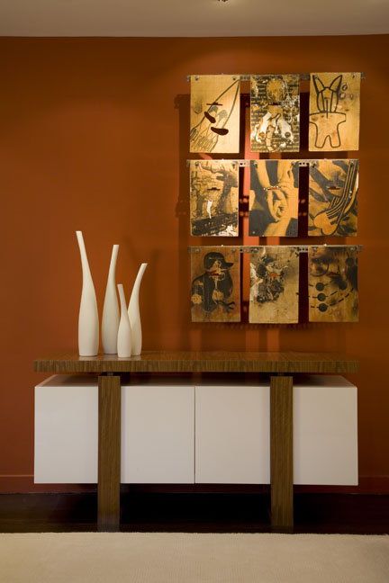
The paneling is the back side of the closet cabinet and is the backdrop to a Botello lithograph.
I’m convinced higher standards of design can be brought to the residential construction market, where it’s kept low on purpose. Think of all of the other products and services we come across where design and engineering are indicative of standards of excellence, light the automobile industry and electronics. The fashion industry has probably done it best, where it’s possible to be fashionable at any price point.
Sustainability starts with good design. In this day, “less is more” has a new meaning. Live better with less, but for that, a shift in the mentality to favor quality over quantity is required.
Next, I’ll show you the rest of the apartment.

August 17th, 2012

Why I’m Doing This

Uncategorized

In 2006, I purchased an apartment with stainless steel appliances, granite countertops, mahogany cabinets, alabaster chandeliers and a host of other amenities buyers covet. I bought it because the space was well proportioned, had a good amount of natural light and was conveniently situated. A week after acquiring property, a second set of renovations began, which corrected what I consider intrinsic design flaws, which could have been easily addressed when the building was being renovated according to market standards for “high end” apartments.

The real estate bubble burst right after this purchase and then in 2008 the economy started tanking and my property appeared to hold it’s initial value according to appraisals made in 2009 and 2011. Fast forward to 2012 and the real estate market is “hot” again in Washington, DC. The time was ripe to sell.

The big question was how much a buyer would be willing to pay for the improvements made to this space? The short answer is nothing, zip, zero. In fact, when an appraisal was ordered, the price placed on the unit was lower than what it had been in 2009 and 2011. Why? Because of what lenders look at as “comparables.” In other words, unless a buyer was willing to make up the difference in cash to qualify for a loan, I’d have to sell for much less than what I bought and on top of that, absorb the cost of the renovation.

After three months I removed the apartment from the real estate market. I’m keeping it. It’s not overpriced, it’s underpriced; without doubt one of the best apartments in DC.

Ernesto Santalla conducted a renovation of his apartment to improve a standard, developer-grade space into a contemporary oasis.
You really do get what you pay for.

August 12th, 2012