Spending Money Wisely

Uncategorized

I realized years ago that every line added to a drawing will cost money. When working on a renovation, especially, it’s easy to get carried away and add more work assuming it won’t cost much. Oh what a treacherous path to follow that is, because costs can get out of hand and once an idea is “sold,” it’s hard to give up. To stay out of trouble, I remind my clients that anything that’s there and we don’t touch doesn’t add cost to the project. On the other hand, keeping things doesn’t always result in savings or a better project, so it’s a value judgement.

Condominium renovation projects are complex for many reasons. There is a committee, which reports to the Board of Directors, who represents the Condominium Association and is responsible to them. Renovations are usually overdue, budgeted years in advance and typically include a lengthy list of requirements and a multitude of opinions. The Dupont East in Washington, DC, was not exempt from these circumstances, but add to the mix the economy was at a very low point when the project was designed in 2009 and spending money wisely suggested not spending any at all.

The project involved the redesign of the Lobby and the residential corridors. The building was built in the 1970’s and the public spaces had been last renovated in the mid to late 1980’s. There was no documentation of what the original Lobby looked like from photographs, but we had the floor plans. The committee was in agreement that the Lobby was dark, the color scheme dated, and the furnishings out of place in this building.

 

P1020466


The front desk had been retrofitted many times to accommodate security, an entry system, computers, etc. The building does not have a dedicated mail room, so the mail is received and sorted by staff. The entry doors were wood and glass in an all glass enclosed space. The peek-a-boo design struck me as odd. Very dusty drapes gave the space a “homey” feeling and traditional furniture in vibrant colors gave it a “modern edge.” The gold metal wall opposite the entry doors was well, gold and shiny.

Photo Not Available (It’s Designed For You)

Uncategorized

My job often consists of designing or redesigning space. For that, I have to visualize what it is going to be, which is something I’ve been doing for 35 years, when I first entered Architecture school. It seems like the Dark Ages now, but the tools we used to convey our ideas were pencil, paper and and cardboard models. Fast forward to the present day and we still use pencils and paper, but a napkin sketch can be quickly put to the test with computer models, which allow us to explore options more rapidly.

When making a presentation to a client, we will typically present a combination of plans, photographs, samples and computer renderings. Despite what is often information overload, sometimes it’s not enough, especially in remodeling projects because it requires moving beyond the image of what is there to visualize what it could be. So when presenting an idea on how to transform or create a new space, we are often asked where is there something like it, or whether can I provide a photograph of it? Sometimes the answer is “no.”


HOME_PHOTO_NOT_AVAILABLE-01

Champagne Taste With Coca-Cola Budget? Have Your Cake And Eat It Too

Uncategorized

Food puns aside, projects are always faced with realities like completion dates and budgets. Budget and cost are two very different things, however, as we often want things that fall outside of the stipulated budget. While some will sacrifice, others will incur additional costs when faced with the fact that the budget did not match the desired outcome. That is the balancing act that design professionals face on a continuous basis.

There are many factors that affect the cost of a project, including geographic location, the choice of contractor, the cost of building materials, finishes and the economy. Budgets are established in different ways, ranging from very detailed studies using complex formulas to simply stating how much money is available to fulfill a wish list. While it’s essential to set guidelines and goals before the design process begins, a budget is based on assumptions and speculation, rather than an actual design. And as happens in smaller projects, clients may not know what their budget is.

So how does the design professional reconcile budget and cost? There are some guidelines I’ve developed over the years that are helpful. In many ways it comes down to what is a “necessity'” and what is a “nicety.’

The driving force behind every project is the quality of the space. Building a good space means that it is well proportioned, functional and pleasing. In my mind, this is a necessity. Building a poorly designed space and a well designed space generally cost about the same, which is an essential to know. The flexibility comes in the materials and finishes and how to make the most of available economic resources.

Is it Art or Trash?

Uncategorized

It moves us to laughter or even to tears. Sometimes it’s funny or perhaps frightening. It comes in any imaginable shape, size, color and material. It inspires. It’s masterful, poetic, delicate or violent. It’s anything and everything imaginable. It’s Art.

From prehistoric caves to man caves it shows up everywhere and sometimes out of nowhere, but its presence is undeniable. Trash becomes treasures to keep and collect or sell at auction. It’s always part of the avant garde, yet the best is ageless. New forms emerge and often dismissed, only to be recognized as a force to be reckoned with later on. Once it becomes mainstream, however, it’s already a part of history. It’s highly personal and even if you don’t like it, it may be undeniably good.

CHAUVET CAVE


Wall paintings found at the Chauvet Caves c. 32,000-26,000 BC


man-cave-art-2


Present day self-expression found in a Man Cave, perhaps a work of découpage in progress

Has The Design Professional Become A Dinosaur?

Uncategorized

The amount of information available through the websites of architects and interior designers, social media sites, online communities, blogs and reality shows gives consumers unprecedented access to the world of design. Add to that lifestyle retailers, and it appears we can assemble everything  we need to outfit a home, remodel it or even build it from the ground up. Even though statistical evidence shows that costs escalate as much as 40% compared to what it would cost if hiring a design professional, most DIYers would do it all over again.

DINOSAUR SKELETON

DESIGNOSAURUS REX

Talent? Or Is Hard Work What It Takes? Part I

Uncategorized

There is this elusive thing called talent that follows me around. Frankly, I’m not concerned about it because ego isn’t what gets me out of bed in the morning. It’s the desire to do what I did the day before but with a little more wisdom and insight and continue down the path I’ve chosen or have yet to choose. One of the things I’ve learned is I can do whatever I want, provided I apply myself to it. In my case, I’m a design professional and a business man. To be honest and equally thankful, there is more than plenty for me to learn in both of these endeavors.

TALENT


Question or statement?


I received a Bachelor of Architecture from Cornell University in 1984. Diploma in hand I moved to Washington, DC without a stitch of work experience and was grateful to get a job within a week of arriving. My first assignment was to make changes on a drawing I did not understand and therefore, I had no clue what I was doing. I fought the urge to get up and quit on the spot, and determined to rough it out for a year. After nine months I had a new job where I spent the next ten years.

Make Room For The Diva

Uncategorized

I love the Opera. The intensity, the grandeur, the music, the sets, the costumes, the drama; and the Diva, around which many a story line is centered. The adoring public awaits her entrance, yearning for the moment she transports us from heights of pleasure to the depths of despair. The Diva transfixes us and after that, nothing is ever the same; especially if she cracks on a high note.

Opera is often about pomp and circumstance and it’s no surprise that the spectacle offstage at the Opera House can be equally dramatic.

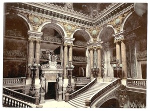
PARIS OPERA


The Opéra Garnier in Paris; is the stair for the space or the space for the stair?

Are Windows In Search Of Treatment? Or Architecture?

Uncategorized

There’s and industry term I find both confusing and amusing at the same time: window treatments. What comes to mind is “are they ill?” I prefer to refer to  them as “window coverings.” Used to enhance the aesthetics and architectural elements of the window and the room, they are very effective.

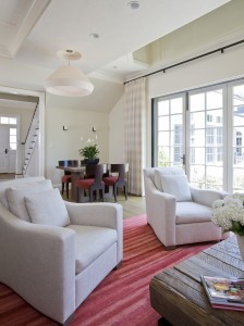
Franzen


Just like any other component in a space, drapery serves a function. In this case, the primary function is privacy. The large expanse of doors is a great architectural feature until you realize the neighbors aren’t using their binoculars to look at wildlife. In this case, we specified a very simple, gossamer drape in the same color range of the wall. We chose to take them to the underside of the ceiling to emphasize the height of the room. Simple. Beautiful. Done.

Less Is More Again

Uncategorized

Housing size has ballooned in the last 60 years. The average size of a new American home in 1950 was 983 square feet; by 2011, the average new home was 2,480 square feet. In 1950, an average of 3.37 people lived in each American home; in 2011, that number had shrunk to 2.6 people. This means that in the US we take up more than three times the amount of space we did 60 years ago.

Furnishings, electronics, vehicles, clothes and kitchen gadgets fill these homes; all at the service of size, which has equated with prosperity in the American suburb. At least until recently when a change has been set in motion. The younger generations want to live in centers of activity, major cities, or the satellite cities surrounding them. Empty nesters and those of retirement age who may want to downsize find themselves unable to do so because the drop in the housing market left them with a home worth less than anticipated.

As urban centers become more desirable, the cost of living rises and many are priced out of the market. Short term solutions include rooming situations and living with parents after college. There is another option. Live in less space.

Good Design or Bad Design?

Uncategorized

Electronic check-in and boarding passes? Good design.

Not enough space on a form to enter an email address? Bad design.

Rubber shoe covers? Good design.

The Ford Pinto? Bad design.

Everything we use has been designed. Sometimes it’s effortless to the point we take it for granted and then there’s the day the release latch on the umbrella is stuck and it’s pouring rain. What is the criteria to distinguish a good design from bad design? First, it must provide a viable solution to a need or desire. Next, it must serve its intended purpose. And finally, it must withstand its usable life cycle.

When it comes to architectural design, the criteria is simultaneously easier and more complex because of all the possible permutations of a single idea. I’ll use some of Studio Santalla’s projects to discuss the concept.

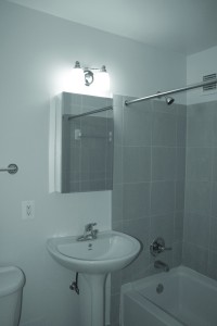
BATH2-BEFORE


This is a 5 ft x 7 ft bathroom. It’s used just about everywhere in the US; it’s the standard when planning a bathroom. Does it provide a viable solution? Yes; and it works for its intended purpose and with proper care it will last for years. It’s a space efficient design. But is the instance shown in the photo a good design? No.

Page 2 Show More Post31 Posts left