Creative By Choice

Uncategorized

I like to be in the mindset to photograph. My “day job” requires that I be creative on demand, so when looking for a creative outlet, I want to be relaxed. It therefore coincided with vacations that I snapped away. I have a preference for cities over country sides and being an architect, it’s no coincidence I am drawn to architecture.

Much of subjects of my B/W photography are architectural, if not architectural photography, which is a specialty within photography. Black and white film photography requires patience and discipline. The patience is in recognizing that what you are seeing in color may not translate in to a good image in black and white, which is where discipline takes over. The mind needs to compose an image in black and white of a scene you see in color.

I don’t have that many images from the 90’s, either because I haven’t had them digitized or the negatives have been misplaced or damaged.

Here’s one of the survivors.

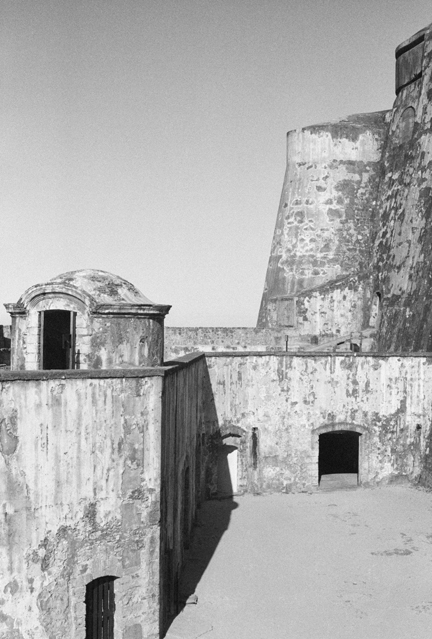
Morro, by Ernesto Santalla Photography
Morro, 1994

I took this image in 1994. I lived in Puerto Rico for twelve years, from 1970 to 1982. My parents stayed on for another 12 years before they moved to Miami. On what was the last visit “home,” I went to Old San Juan and to to El Morro, one of the two major fortifications built by the Spanish, which guarded the city from naval attacks.

“Morro” represents those formative years of my life and an homage to that beautiful country of wonderful people.

Ciao.

Like

September 21st, 2012

Treetops-The Full Results

Uncategorized

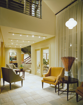
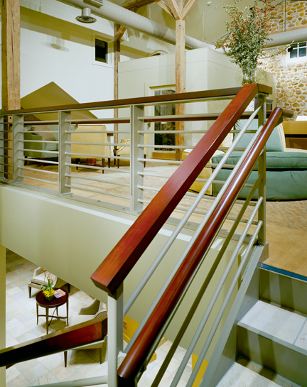
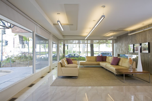
At the end of Treetops Part 1, I left you with this image of a Clubhouse my office redesigned for a residential complex in West Chester, Pennsylvania.
Lobby of clubhouse redesign by architecture and interior design firm Studio Santalla
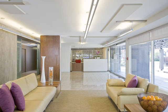
This building had a very utilitarian entry. The front doors led to a bulky stair that connected to the balcony you see at the top of the image. As part of the renovation, the plan involved relocating the stair to a central location in the building, which opens up the front space as a double height entry foyer.
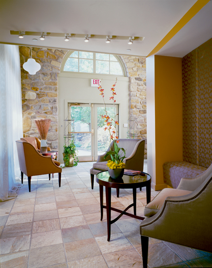
Entry of clubhouse redesign by architecture and interior design firm Studio Santalla
The stone walls created the context from which the color scheme was created. With this, we created a connection to the existing building, while working within a decidedly contemporary aesthetic. I showed this image during an interview for a new project and was asked if this is a boutique hotel. I smiled.
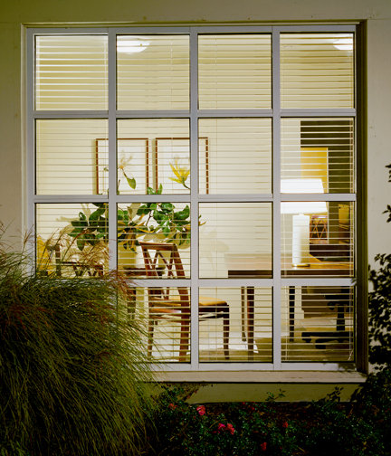
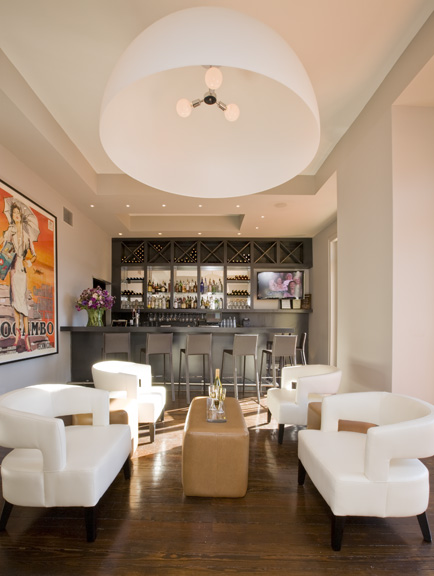
Clubhouse redesign by architecture and interior design firm Studio Santalla
In this kind of project, part of our job is creating an image of a lifestyle. The front office, therefore, “feels like home.”
Loft lounge space of clubhouse redesign by architecture and interior design firm Studio Santalla
This image shows visual continuity between the lower and upper levels. The goal was to make a clear delineation of “old” and “new,” in a comfortable way.

September 17th, 2012

Motorcycles, Angels and Dinosaurs

Uncategorized

I recently saw a time lapse video showing the construction of a 30 story hotel tower in 30 days from ground breaking to complete interior fit out. It was impressive and commendable on many fronts, including sustainability. What the video didn’t discuss is how much time it took to design this structure, because to make it work, just about every single item that went into the building was pre-fabricated and arrived on the project site ready to install like life size Legos.

The point is architectural projects take time and are not the indulgence of choice when looking for a dose of the pleasure principle.

To that reality of my profession of choice, I’ve found other creative outlets, which yield instant results, like photography. I first started taking photos with film, which I processed and then printed. In a matter of hours I’d see results; the creative equivalent of one of those energy drinks.

This is one of the first photos I took with my one and only camera, which I now refer to as my pet dinosaur.

Form/Function by Ernesto Santalla Photography
Form/Function
I took this image in Ithaca, New York when I was studying Architecture at Cornell University in 1983.


September 14th, 2012

Design In Retrograde

Uncategorized

When I moved to DC in 1984, we were in the throes of Post-Modernism. We had rediscovered classical architecture and had once again started adorning our buildings with columns, pilasters, cornices, acroteria and palmettes. We shunned Modern Architecture for all the damage it had inflicted on the quality of our lives and the planning of our cities and thought this Re-Renaissance would provide the answers. Those at the forefront of the movement reinterpreted classicism, making bold expressionistic statements. As most everyone, I was exhilarated by what was going on in architecture and poured over my books looking for sources of inspiration in antiquity.
Luckily, it was a fad, a hiccup in the careers of those who were caught by the frenzy. I still think some of the work I did during this period is good and I’m happy to share it.
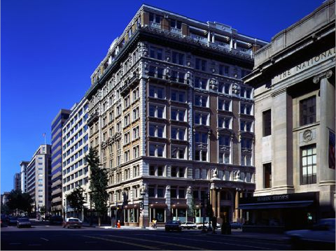
The building in question is The Colorado Building, located at the corner of 14th and G Streets in downtown DC. I worked on this project while employed at KressCox Associates.
Ernesto worked on the Colorado building in Washington, DC while with KressCox Associates
Built in 1903, the building was in bad shape and needed a major interior renovation and restoration of the façade. The ground floor level bay windows were fully restored according to archived drawings, which we were fortunate to find. The most exciting part for me was the two-story roof top addition, designed in such a way that complemented the existing structure. As to how these types of additions should be done, if at all, is still a controversial subject.
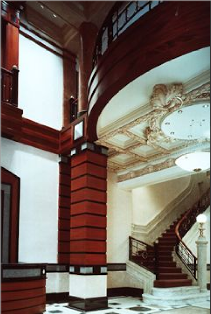
The Lobby was re-envisioned as an extension of the exterior, with fine woods, stones and metals. An existing marble staircase and plaster ceiling were restored.

Commercial interior of Colorado Building in Washington, DC designed by Ernesto Santalla while with KressCox Associates

Once the major renovation and restoration work was completed, the firm was engaged to design a number of the office spaces, which became my foray into the world of commercial interiors.
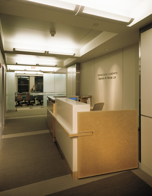
My favorite space was designed for the international law firm WEMED. The client told me the building gave them “establishment,” so he wanted a contemporary interior, and I was happy to oblige.
Contemporary law firm interior by Studio Santalla in Washington, DC

This image is from a 1999 renovation done when I was at Forma Design, Inc., which retained much of the original design, such as the wood paneling, the frosted glass, furniture, etc.
Here’s another view of that space.
Contemporary law firm interior by Studio Santalla in Washington, DC

I think the WEMED space, originally designed in 1990 still looks great, while the 1988 Lobby, makes me cringe. I’d be happy to “repent” for past indiscretions, however, and redesign the Lobby and do something which focuses on the quality of the space and incorporates the items from the original design, which were found during the renovation, as opposed to focusing on surface decoration attempting to make them blend in.
Post-Modernism was a short-lived. A lot of exciting and innovative work has been produced in Washington, DC since then, I am happy to say.
For more information on Studio Santalla, visit our website at www.studiosantalla.com
Like us on Facebook
Follow us on Twitter


September 4th, 2012

Everyone’s A Designer [Part 2: Commercial]

Uncategorized

Part of what gives businesses a competitive edge is design. Where would a brand like Apple be without superior design? Lost in a sea of competitors. Ian Schrager’s hotels always stand out because of design. How do new office buildings justify charging higher rents? Location, amenities and you guessed, state of the art design.
Condominium buildings are commercial buildings for residential use, which means that all the public spaces need to be designed to commercial standards, using the appropriate materials, finishes and furnishings. Every fifteen years or so, design committees are charged with “redecorating.” Sometimes, these committees have good leadership with a clear vision that leads to great results. Here’s one.

BEFORE
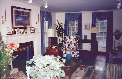
From what I gather, a “cozy look” was the direction this condo building in DC took in the 80’s, replete with reproduction antiques.

Before photo of condo lobby features cozy furniture and faux antiques

Would you have known this is a modern era building looking at that photo? Is the purpose of design to take us back in time? Our memory of the past tends to be idealized in my experience.
AFTER

Condo lobby renovation by Studio Santalla in Washington, DC uses tons of natural light.
The amount of natural light in this space at all hours of the day is amazing.
BEFORE
Gold is often associated with prosperity. Here, a wall clad in shiny gold metal added drama? pizazz? a wow factor? If there was one unanimous request from the committee, it was to take it out.
Before photo of condo lobby renovation feature's glitzy gold wall
AFTER
Condo lobby renovation by Studio Santalla in Washington DC has been transformed into a bright and modern space
Welcome to the 21st century and an uncluttered space.
We were asked to renovate a B&B in Flint Hill, Virginia. I told our client I was taking the “country” out of Inn, which he wholeheartedly endorsed.
BEFORE
before photo of renovated bar by Studio Santalla
This space is next to a deck, so we made it in to a Pub. As to what it was before? Some things are best forgotten.
AFTER
Washington, DC architecture firm Studio Santalla redesigned the bar of Flint Hill Public House and Country Inn to achieve a sophisticated, contemporary space
This picture makes me smile every time I see it.
Take a look at the rooms.
BEFORE
Photo of suite at Flint Hill Public house before the transformation by Studio Santalla
The building has great windows and beautiful light. Our job was to get rid of the distractions and capitalize on the assets.
AFTER
Washington, DC architecture firm Studio Santalla transformed the suites of Flint Hill Public House and Country Inn into sophisticated, modern retreats
The rooms are all suites. We solved the “where do we put the TV?” issue by designing a cabinet that swivels, so you can watch from either side of the room. It also helps create two separate areas.
More to come, so stay tuned. Thanks to all of you who have been following the blog.
Ernesto

August 29th, 2012

Everyone’s A Designer [Part 1]

Uncategorized

I decided to study architecture when I was 16. It wasn’t the first career choice I considered; at 5, I wanted to be a priest. I started college at 18, graduated 6 after that and it’s been 28 since, so if you are really interested in finding out my age, you can do the math.

One of the things I learned early on in architecture school is we are all designers. Any controlled activity is designed and sometimes changes the course of history, like the way the invention of the flush toilet is linked to the viability of the high rise building. Ok, reinforced concrete was instrumental too.

So if all of us are designers, why the need for a design industry? Notice I didn’t say everyone is a good designer. One of the reasons clients hire my firm, Studio Santalla, is they have something they want changed and we can figure it out for them. So today, I’ll share a few select moments involving a leap, a feat or a coup!

Here’s a project we completed in the early days of Studio Santalla.

BEFORE

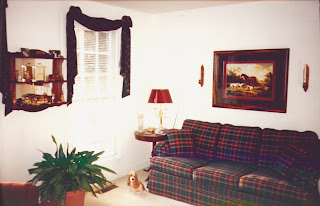
photo of Virginia home before renovation by Studio Santalla

I understand Laura Ashley spent her last days here. Upon her passing, it was time for a change.
AFTER

Contemporary traditional renovation by Washington, DC architecture and interior design firm Studio Santalla in Northern Virginia.
Another room sported a hunting theme, replete with hound-in-training.
BEFORE
Home office before renovation by Studio Santalla
The new work was partially funded by a yard sale, no joke.
AFTER
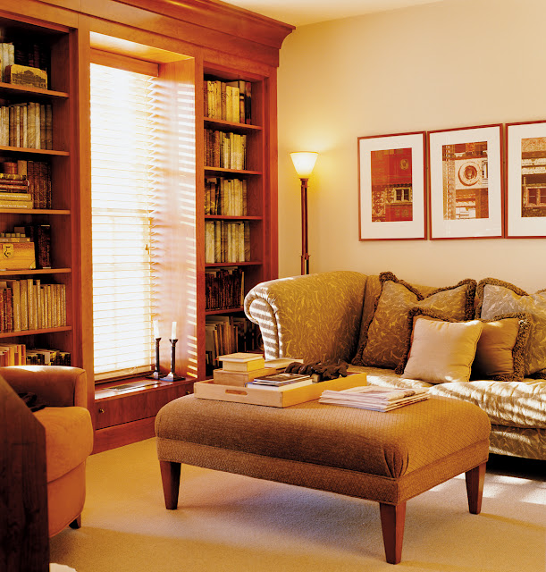
Contemporary traditional home library by Washington, DC architecture and interior design firm Studio Santalla in Northern Virginia.
I think there is more “colonial” architecture in DC than Williamsburg. No wonder we are still referred to as “provincial.”
BEFORE
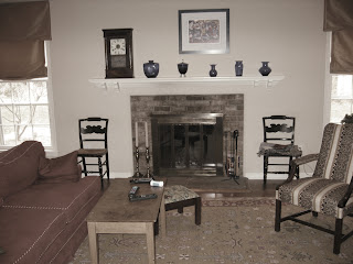
Photo of living room fireplace before renovation by Studio Santalla
Sometimes, it’s about helping people find their inner “design” voice. Whew!
AFTER
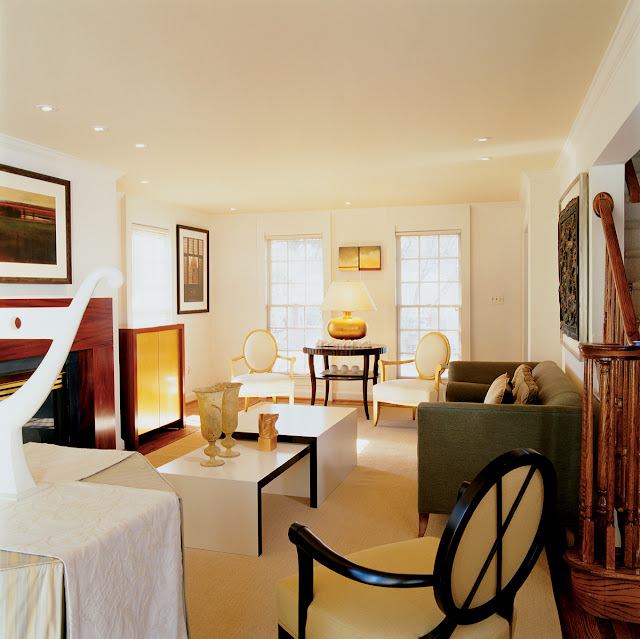
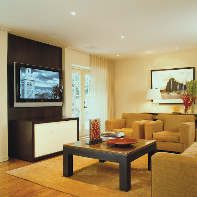
Contemporary traditional living room designed by Washington, DC architecture firm Studio Santalla features a built-in media center and modern furniture
Truth be known, the person who designed this workstation intended it in the most temporary, makeshift way, but it makes for a great “before” shot.
BEFORE
home office before renovation by Studio Santalla
The workspace, redefined as a showplace for art.
AFTER
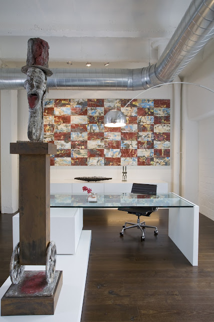
Modern, luxury home office designed by Washington, DC architect firm Studio Santalla has been transformed into a showcase for contemporary art
Painting by Keith Milow; Sculpture by Nelson Carrilho
I love my job and I’m 52, BTW.
For more information on Studio Santalla, visit www.studiosantalla.com
You can also “like” us on Facebook https://www.facebook.com/studiosantalla
Oh, why not?
Twitter: @Studio_Santalla @ernestosantalla

August 27th, 2012

Design For Art or Art For Design?

Uncategorized

A few summers ago, I received a call from Drew Porterfield,  Gallery Director at Long View Gallery in Washington, DC to invite me to participate in an upcoming show. “Informed Design” was an illustration of how art and design relate. I was immediately drawn to the project and accepted the invitation.

This project became a vehicle to illustrate in a vignette how all the elements that go in to a design contribute to the whole and how it all comes together is as important as any of the components.

I started by considering the space and the parameters. I limited my “interventions” to three surfaces-two walls and the floor. Being a temporary exhibit, I could not make permanent changes to the space, so one of the themes I worked with was weightlessness. The design revolves around two pieces of art, which were created for the exhibit. I used the back wall of the gallery as a backdrop to a hanging sculpture by Barbara Josephs Liotta. In contrast to the serenity and quietude of this piece, Ralph Turturro painted a series of canvases that when combined, measure almost thirty feet long. The floor completes the composition, using pattern to emphasize the movement through the gallery and give the space subtle definition.

I think it’s time to show pictures.
First, the gallery space as seen from outside.

Barbara Josephs Liotta’s piece “Cleia” is set off by the shape and color of the wall behind it, which I was allowed to paint. Upon entering the gallery, the eye was immediately drawn to this piece. In the foreground a wood bench I designed for the exhibit, which the critic who reviewed the exhibit loved for its “reptilian qualities.”


Ralph Turturro’s “Genesis” hovers in front of the structural column, which is also part of the composition. What looks like the shadow of the bench is actually a different carpet color. It visually anchors the bench in the space as well as being another compositional element.
A long shelf completes the composition at the front of the gallery. Sidra Forman created the floral concept consisting of air plants, which are beautiful and lasted well beyond the time the show was taken down and required zero maintenance.
A view of the gallery as seen when leaving the space. If my work is all about how everything comes together, the goal is to make it look effortless.
I want to give thanks where thanks are due and this project was possible because of
Barbara Josephs Liotta, www.barbaraliotta.com
Brogan Wood Products LLC,  www.broganwoodproducts.com (wood veneers)
Potomac Woodworking, www.potomacwoodwork.net
Sidra Forman, www.sidraforman.com
J+J Invision, http://www.jj-invision.com (carpet tile)
and of course, Long View Gallery, www.longviewgallerydc.com
Finally, I was honored to do this exhibit in conjunction with David Jameson, whose work is outstanding. www.davidjamesonarchitect.com
This exhibit created future opportunities for me, but more on that later. Happy hump day, formerly known as Wednesday!

August 22nd, 2012

How I Did This? Part 2

Uncategorized

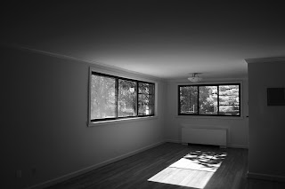
The crux of the renovation of the spaces in my 962 sf apartment was the bathroom and closet area, but the rest needed attention to make it all come together.

Kitchen
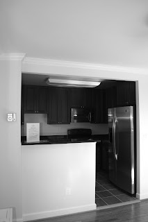
I love open kitchens, but this example does not fit the profile.

The before view of the generic kitchen in Ernesto's Washington, DC apartment.
The kitchen was a mismatch of appliances, lighting, cabinetry and flooring shoved in to a small space.


Here’s what I did to it:

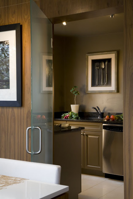
A glass door closes the kitchen from the rest of the apartment
The space was enclosed in the same wood used elsewhere and a frosted glass door was added to close it off entirely when desirable. The cabinets were painted. In fact, everything in that room was painted the same color to give it unity and minimize the contrast between the color of the walls and the black countertops. The upper cabinets were removed.
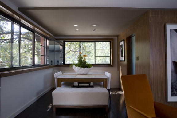
The Living and Dining areas has great window space, so I took a great asset and made it better.
The dining room of Ernesto's apartment before the renovation
Before
The two window groupings were connected by a thick piece of wood trim. The inside corner was covered with mirror, which gives the sense of it being all glass. Notice the slight drop in the ceiling above the table. It set’s off this area from the Living Room area in the foreground.
Trim and mirror connects the two window groups in the dining room
After
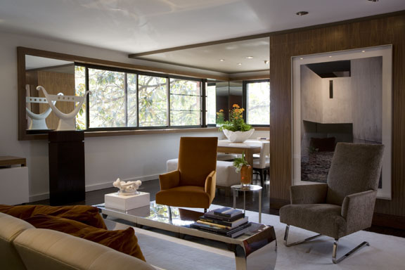
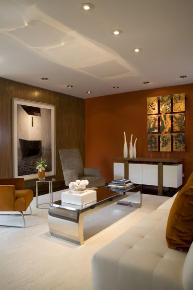
The remaining spaces complete the concept.
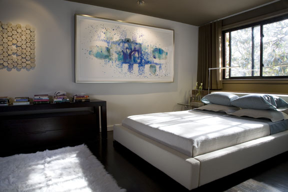
Ernesto's living space post-renovation
Walnut panels and bold colors complete the living space in Ernesto's apartment renovation
Statement artwork is the finishing touch on the bedroom in Ernesto's renovation
And finally, this image was on the cover of Home and Design magazine.
This image of Ernesto's renovation was featured on the cover of Washington Home & Design Magazine
Cover of Home & Design magazine
Conclusion
I purchased this unit because it could be “fixed.” Most of this could have been done when the building was renovated for virtually the same cost. Good design is good business. That the real estate market values this apartment according to a formula dictated by lending institutions is unfortunate. The mortgage industry fell apart because people were allowed to get in way over their heads in homes that were too large for them, not because of design. Quality is sustainable; it starts with good design.
Ciao,
Ernesto

August 20th, 2012

How I did this? (Part 1)

Uncategorized

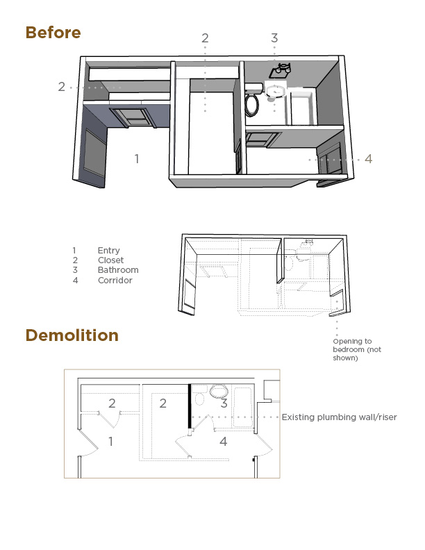
What did I do to the “functional” bathroom, closet and corridor area of my apartment? I took it  out and started over.

Here’s an analysis of the “before.”

Diagram describing the before view and subsequent demolition of the bathroom area.
The only thing left standing in the area was the plumbing wall adjacent to the commode. It contained pipes that are common building elements, which could not be moved. The rest of the walls came down in what seemed a matter of minutes.
This is the design that was built.
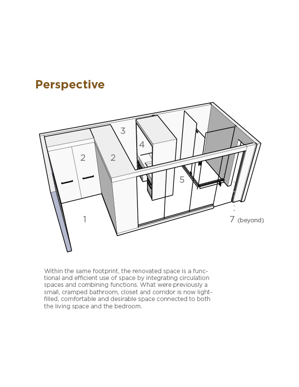
This diagram depicts the design of the renovated bathroom in Ernesto's apartment renovation.
1Entry
2Millwork (cabinetry) Closet
3Dressing Area
4Vanity
5Shower & WC
6Frosted glass
7Bedroom
I will be the first to tell you I called in as many favors as I could to get the best quality materials for the least amount of money possible. The point is it could have been done using less expensive materials and finishes to fit the developer’s budget. I come across this situation time and time again, where the starting point is fixing inherent design flaws for which the consumer paid a premium. So-called amenities are in reality marketing buzzwords, like “crown moulding,” which in DC ranks high on the list alongside “granite countertops” and “stainless steel appliances.”
Now for the pictures of the finished space.
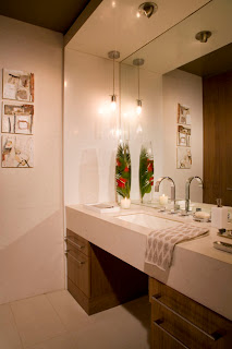
Bathroom vanity designed by Ernesto Santalla during the renovation of his apartment.
Goodbye small pedestal sink, hello comfort and function-appropriate lighting.
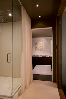
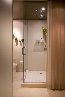
Shower and passage to the bedroom in Ernesto's apartment renovation
A view from the bathroom to the bedroom. You can catch a glimpse of the glass wall separating this area from the Living Room on the right. Since I was going to live there alone, I removed door in to the bedroom.
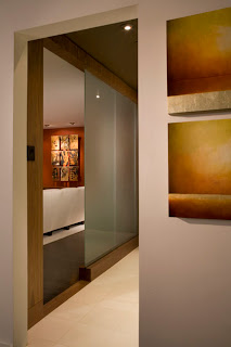
View of the design of the glass wall that allows light to filter to the bathroom
This image is taken in the bedroom looking out towards the Living Room. Notice how the frosted glass wall gives total privacy but still allows for filtered light in to this area. The door is open in this image and in the one below.
A drapery panel conceals the shower when privacy is needed.
By moving the sink, I was able to make a very large shower. The drape covers the area when not in use gives additional privacy when needed.
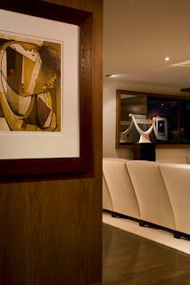
Walnut panels greet entrants to this apartment, renovated by architect and interior designer Ernesto Santalla
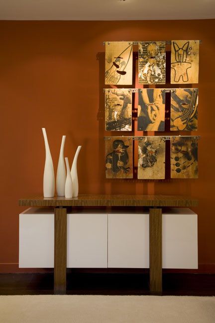
The paneling is the back side of the closet cabinet and is the backdrop to a Botello lithograph.
I’m convinced higher standards of design can be brought to the residential construction market, where it’s kept low on purpose. Think of all of the other products and services we come across where design and engineering are indicative of standards of excellence, light the automobile industry and electronics. The fashion industry has probably done it best, where it’s possible to be fashionable at any price point.
Sustainability starts with good design. In this day, “less is more” has a new meaning. Live better with less, but for that, a shift in the mentality to favor quality over quantity is required.
Next, I’ll show you the rest of the apartment.

August 17th, 2012