Champagne Taste With Coca-Cola Budget? Have Your Cake And Eat It Too
Written by Ernesto Santalla on April 30th, 2013 // Filed under Uncategorized
Food puns aside, projects are always faced with realities like completion dates and budgets. Budget and cost are two very different things, however, as we often want things that fall outside of the stipulated budget. While some will sacrifice, others will incur additional costs when faced with the fact that the budget did not match the desired outcome. That is the balancing act that design professionals face on a continuous basis.
There are many factors that affect the cost of a project, including geographic location, the choice of contractor, the cost of building materials, finishes and the economy. Budgets are established in different ways, ranging from very detailed studies using complex formulas to simply stating how much money is available to fulfill a wish list. While it’s essential to set guidelines and goals before the design process begins, a budget is based on assumptions and speculation, rather than an actual design. And as happens in smaller projects, clients may not know what their budget is.
So how does the design professional reconcile budget and cost? There are some guidelines I’ve developed over the years that are helpful. In many ways it comes down to what is a “necessity'” and what is a “nicety.’
The driving force behind every project is the quality of the space. Building a good space means that it is well proportioned, functional and pleasing. In my mind, this is a necessity. Building a poorly designed space and a well designed space generally cost about the same, which is an essential to know. The flexibility comes in the materials and finishes and how to make the most of available economic resources.
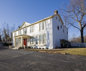
Studio Santalla was asked to work on the renovation of a bed and breakfast, The Flint Hill Public House and Country Inn, located in Flint Hill, Virginia, a 90 minute drive from Washington, DC. The project was meant to be an interior renovation keeping the layout of the first floor intact, except that when the design started, we immediately learned that under the county’s building codes, the restaurant and bar on the first floor had to be separated from the hotel function upstairs, which changed the nature of the project, and created a host of unforeseen necessities required for the business to reopen.
The renovation, now a remodel, required a new fire stair and fireproofing between the first and second floor. Meanwhile, the budget remained the same.
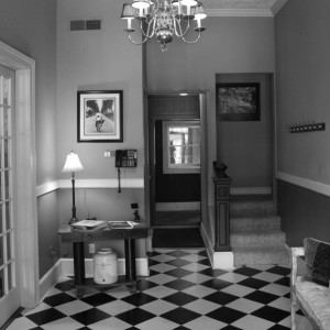
The Lobby had a stair leading up to the rooms on the second floor. Under the new code, this open stair had to be removed and the corresponding floor opening closed off. On the other hand, the existing stair as seen above was not in the best location for either floor, creating new possibilities. Every cloud does have a silver lining.
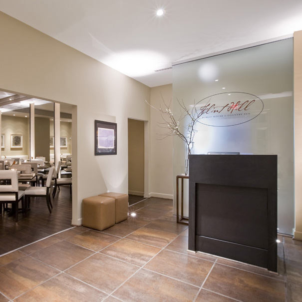
The new Entry to the Restaurant and Pub. The glass wall creates a luminous backdrop and screens the view of the kitchen beyond. The finished space looks complete and doesn’t look like anything is missing, which makes it successful. Can you tell whether any “niceties” were excluded?
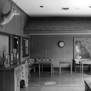
This back room, which opens to a deck and vast grounds beyond, wasn’t integrated from the rest of the restaurant. Upon critical analysis, it became much more logical to have a bar in this space, which would serve the dining rooms and the outdoor dining space.
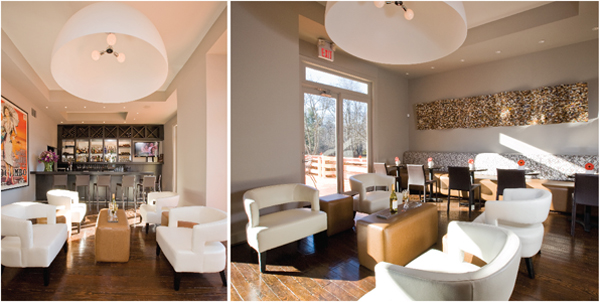
The new Pub is the same size and height as before. A new mechanical system was installed, so we carefully rearranged the “stuff” above the ceiling. Compare the height and width of the back wall and you’ll see it’s the same. What changed is how the space is used. There are three zones now. The bar, a lounge are and a seating are where light-fare is serves throughout the day. The light fixture gives a punch of drama to the space as its focal point. It’s how the elements are arranged that gives it that “high end” appearance.
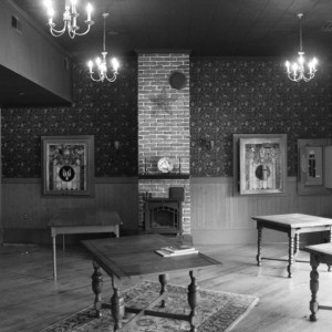
I suppose this fit the description of a “country restaurant.”
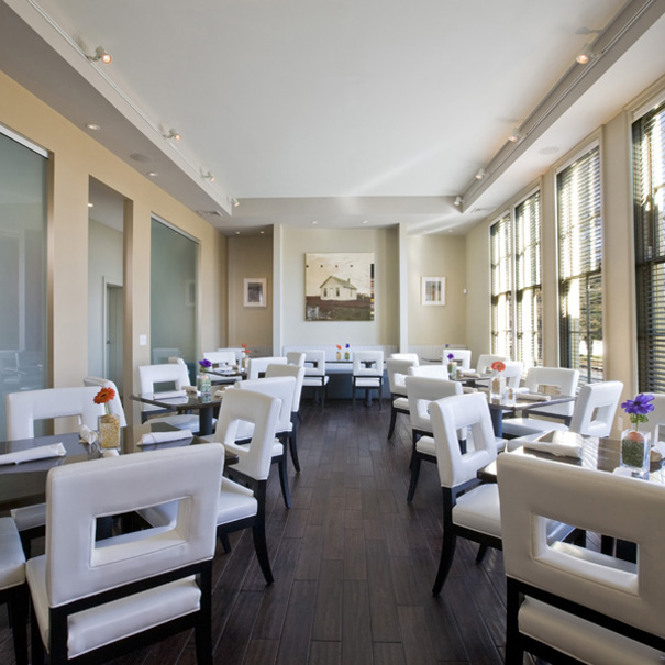
We didn’t take the Inn out of the country, we just took the “country” out of the Inn. Notice how the openings in the interior wall match the windows, which is the only significant change to this room. The frosted glass panels, which give the room separation from a corridor are a very functional “nicety,” but they also bring light in to an otherwise dark space, so they are functional too. When working with a tight budget, everything choice has to be strategic.
Let’s go upstairs to the Inn.
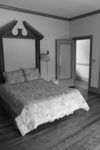
Is this a piece of architectural salvage behind the bed or was a doorway closed off? We have to be very careful how these elements are used. Otherwise they look contrived. We would have liked to reuse it, but it broke in to pieces when it was removed.
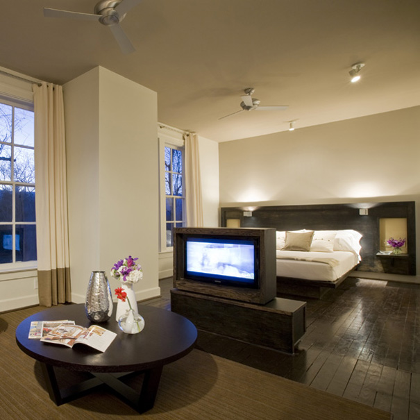
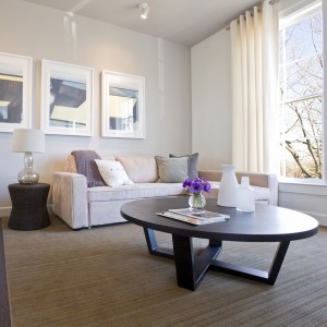
We created four suites, each with a seating and sleeping area. A piece of furniture, which divides the two areas was designed for the television. It has a swivel mechanism so the unit can be turned to face both directions. Pretty nifty, and saved the owner money on infra-structure.
When the Inn opened the reviews poured in. My favorite is “No detail overlooked and no expense spared.” Yes, the client has the cake and gets to eat it too, because the project was completed on time and UNDER budget. Read the client’s review of Studio Santalla’s work on houzz.com
http://www.houzz.com/viewReview/5098/Studio-Santalla–Inc-review
The building was originally built as a school house in the 1900’s, which has been preserved for generations. The new fire stair is on the backside and maintains the integrity of the original structure.
