Before & After Episode 3: This open kitchen is much more than the some of its parts
Written by Ernesto Santalla on August 13th, 2013 // Filed under Uncategorized
Take a look at this kitchen. What’s wrong with it?
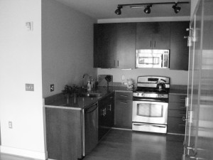
Nothing is wrong with it. We can reasonably assume there is a refrigerator to the right of the stove to complete the “cooking triangle,” so it appears it contains everything required to make it functional and even produce a great meal. Now look at it again.
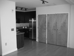
There’s the refrigerator; and we can safely assume the doors are storage next to it. It looks dark in the ceiling, but the track lighting should take care of that. So my next question is, does this kitchen fit what the seller’s label of luxury apartment? Is there enough counter space? Hint: closets cost less to build than kitchen cabinets and granite countertops. Next clue; not all woods are made alike and this mahogany was not top of the heap. If you ask me, however much or little of it was used to make these cabinets was a waste of material. It’s an open kitchen; there is a large loft space with lots of natural light a few paces from the stove. There were no lights on when the photo was taken, but the space was unnecessarily dark. “Lots of storage,” said the real estate listing. Yes, so much so that there is not enough space to prep a meal.
Here’s what we did in this space.
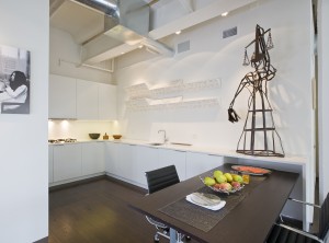
Not all storage is made equal; remember this. Here we removed the closets, which were too deep to function well as pantry space and carefully planned the storage according to the client’s needs. We also moved the dining area to this location.
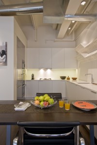
The wall on the right contains the refrigerator, ovens and storage; including a full-height, pull-out pantry.
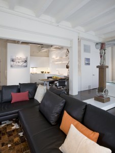
So what was wrong with this kitchen? It wasn’t part of the open flow of the space. It was detached, dark and looked like an afterthought. The lesson we’ve learned is the whole is much more than the sum of the parts.
Stay tuned for more. Comments encouraged.
Ernesto Santalla
