Everyone’s A Designer [Part 2: Commercial]

Written by on August 29th, 2012 // Filed under Uncategorized

Part of what gives businesses a competitive edge is design. Where would a brand like Apple be without superior design? Lost in a sea of competitors. Ian Schrager’s hotels always stand out because of design. How do new office buildings justify charging higher rents? Location, amenities and you guessed, state of the art design.

Condominium buildings are commercial buildings for residential use, which means that all the public spaces need to be designed to commercial standards, using the appropriate materials, finishes and furnishings. Every fifteen years or so, design committees are charged with “redecorating.” Sometimes, these committees have good leadership with a clear vision that leads to great results. Here’s one.

BEFORE
From what I gather, a “cozy look” was the direction this condo building in DC took in the 80’s, replete with reproduction antiques.

Before photo of condo lobby features cozy furniture and faux antiques

Would you have known this is a modern era building looking at that photo? Is the purpose of design to take us back in time? Our memory of the past tends to be idealized in my experience.

AFTER
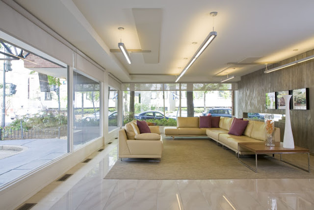
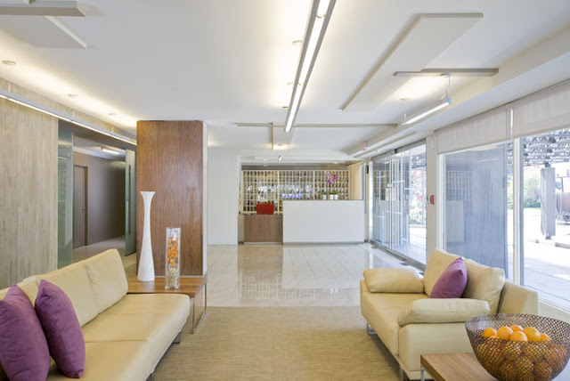
Condo lobby renovation by Studio Santalla in Washington, DC uses tons of natural light.
The amount of natural light in this space at all hours of the day is amazing.
BEFORE
Gold is often associated with prosperity. Here, a wall clad in shiny gold metal added drama? pizazz? a wow factor? If there was one unanimous request from the committee, it was to take it out.
Before photo of condo lobby renovation feature's glitzy gold wall
AFTER
Condo lobby renovation by Studio Santalla in Washington DC has been transformed into a bright and modern space
Welcome to the 21st century and an uncluttered space.
We were asked to renovate a B&B in Flint Hill, Virginia. I told our client I was taking the “country” out of Inn, which he wholeheartedly endorsed.
BEFORE
before photo of renovated bar by Studio Santalla
This space is next to a deck, so we made it in to a Pub. As to what it was before? Some things are best forgotten.
AFTER
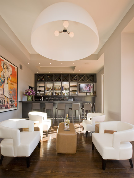
Washington, DC architecture firm Studio Santalla redesigned the bar of Flint Hill Public House and Country Inn to achieve a sophisticated, contemporary space
This picture makes me smile every time I see it.
Take a look at the rooms.
BEFORE
Photo of suite at Flint Hill Public house before the transformation by Studio Santalla
The building has great windows and beautiful light. Our job was to get rid of the distractions and capitalize on the assets.
AFTER
Washington, DC architecture firm Studio Santalla transformed the suites of Flint Hill Public House and Country Inn into sophisticated, modern retreats
The rooms are all suites. We solved the “where do we put the TV?” issue by designing a cabinet that swivels, so you can watch from either side of the room. It also helps create two separate areas.
More to come, so stay tuned. Thanks to all of you who have been following the blog.
Ernesto

Related.

Defining MomentSeptember 26, 2012

Fashionista ArchitectureJanuary 22, 2013

The Houzz of CleopatraDecember 11, 2013

For Green’s Sake, Part 1October 29, 2012

Matching ExpectationsSeptember 11, 2013

Is it Art or Trash?April 16, 2013

How I Did This? Part 2August 20, 2012