Good To Great
Written by Ernesto Santalla on February 10th, 2013 // Filed under Uncategorized
When I was much younger I thought getting an “A” meant you were smart. This paradigm worked for me through most of high school until some of my classmates who for years were the “C” students realized they weren’t going to good schools without better grades and seemingly overnight got the best grades in the class. In college, while studying Architecture, I had to come to terms with doing a great job on one project and then sometimes hearing “this is a really good concept, but it is not well developed,” on another. As I struggled with it and vowed my revenge on receiving just a passing grade. With time, I’ve understood what my professors meant.
The architectural master and icon Mies van der Rohe said “God is in the details.” The finesse with which his projects are executed is testament to the credo, which I’ve come to understand and embrace.
Since it’s my work and I own the bragging rights, I’ll use a few of Studio Santalla’s work to illustrate the concept of taking an idea and developing its potential.

Notice the absence of electrical cords, which would detract from the stunning effect of the light fixture.
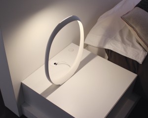
We cut a grommet hole in the top of the nightstand, which connects to an outlet in the wall. For this to work we had to make sure there was space behind the drawer for the plug to connect through the back of the cabinet. Ah! What If I want to charge my phone and keep it on the nightstand? Notice we placed a very inconspicuous plug on the nightstand top. In case you’re wondering, the light fixture has a sensor in the base that is responsive to the heat in the hand and replaces a switch.
A client remodeled their home to expand their kitchen and add a butler’s pantry connecting to the dining room. The arrangement is very functional, but having a door in the middle of the wall was a visual distraction.
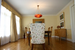
This is a “before” image, but you see how prominent the door is, which formerly connected directly to the kitchen.
To deal with the conundrum, we made the door a panel in the wall, such that when closed, it “disappears.”
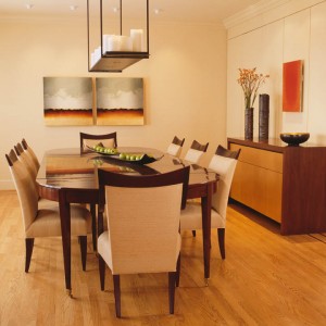
The point is you can’t “see” the door, so here’s another image to prove it’s there.
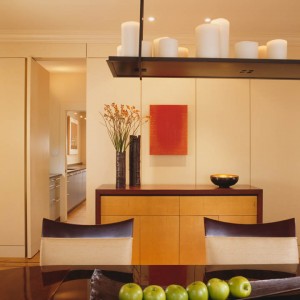
Once the many details are successfully handled, it seems effortless, which is what I think good design should be.
As part of a larger project we designed a bedroom for an elderly woman who has an adjustable bed. Our solution was to fit it to the space and let it function as a daybed as well. The daybed structure is unconnected to the bed frame for unimpeded operation.

Given the functional necessity to have this kind of bed, this part of the room could have been a constant reminder of the onset of age and infirmity. Instead, we created an attractive, inviting, yet equally functional space.
While I don’t ascribe divinity to details, paying attention to them beyond the merely functional can make a significant difference and enhance our experience of space and the objects we place in them.
