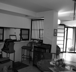
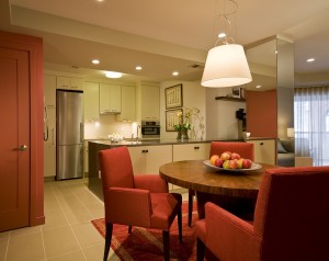
Before & After Episode 5: “Mr. Architect, Bring Down That (Kitchen) Wall!”
Written by Ernesto Santalla on October 22nd, 2013 // Filed under Uncategorized
Much of learning is by association, which is a product of predictability. Some of the most obvious are:
Grass = GREEN
Sky = BLUE
Fire = HOT
Sugar = SWEET
In the world of design, associations, aka preconceived notions, could (should?) be left aside to open our minds to possibilities, but we are creatures of habit and habits are hard to break. I am therefore on a mission to break a habit of ours. It consists of the notion that in order to make a room we have to build walls. By definition, a wall is a boundary, a demarcation, a dividing line. It creates sides and therefore it serves the purpose of delineating things like indoors and outdoors, public and private, and the thousands of permutations thereof.
As a young architect, I thought of kitchens as “out of sight, out of mind,” in the same way that I didn’t want to see televisions, which were bulky boxes. With innovative technologies, shifting sensibilities and changes in the way we live, design has evolved. This is especially relevant in smaller spaces, where in many cases, walls make them confined and uninviting.
Such was the case in a condominium renovation, where the small, cramped kitchen was designed as an enclosed space. The sliding “shoji” panels emphasized it, as well as the bar counter and barstools, which are focused on the kitchen. It’s clearly designed as a separate space.

Our solution to this space consisted of opening the kitchen to the dining space, eliminating the upper cabinets above the sink, but providing a greater amount of storage in the peninsula cabinetry facing the dining area. These cabinets extend into the Living Area to provide more storage. We used the same flooring throughout the condo. The kitchen is now a separate, yet connected area to the rest of the space.

Comments are welcome and encouraged. Stay tuned for more episodes.
Ernesto Santalla
Facebook “likes” are always welcome. www.facebook.com/studiosantalla
Twitter: @Studio_Santalla, @ernestosantalla


