The design of Guapo’s of Georgetown’s new space and prototype presented unique opportunities. First, the challenge to create an expression outside of what is generally expected as Tex-Mex. Second, adapting the restaurant’s operations to a significantly smaller space than what Guapo’s occupies in all of its other locations in the Greater Washington region. And finally, the physical space has low ceilings given by all the mechanical ductwork required to supply and extract air to condition the space.
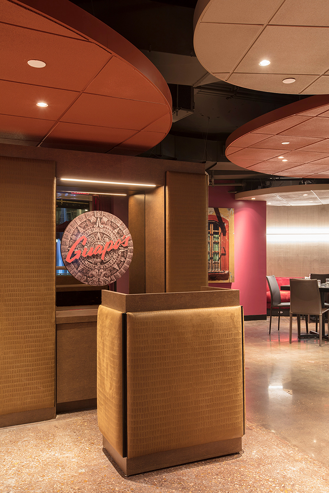
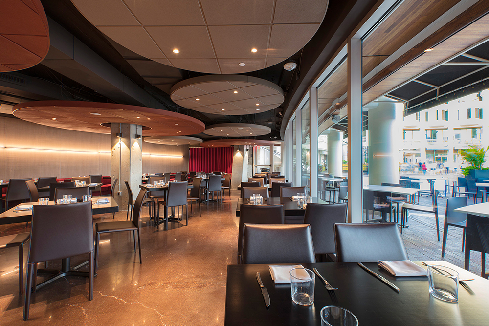
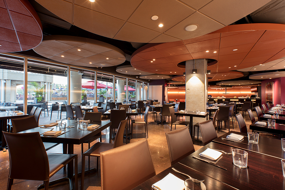
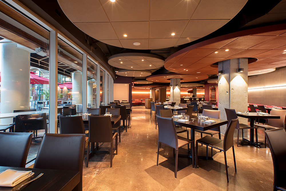
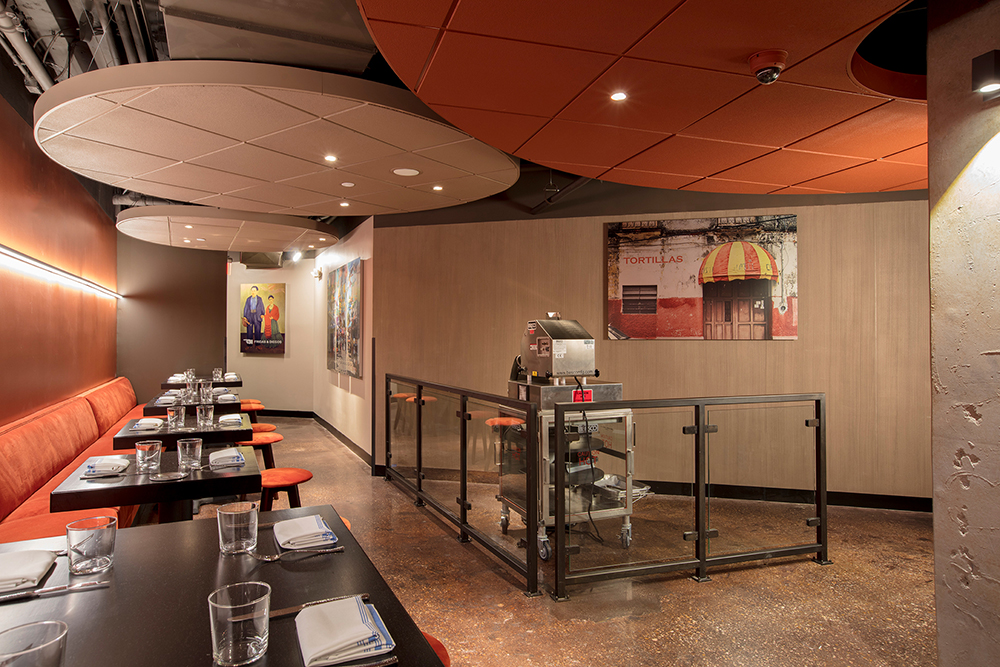
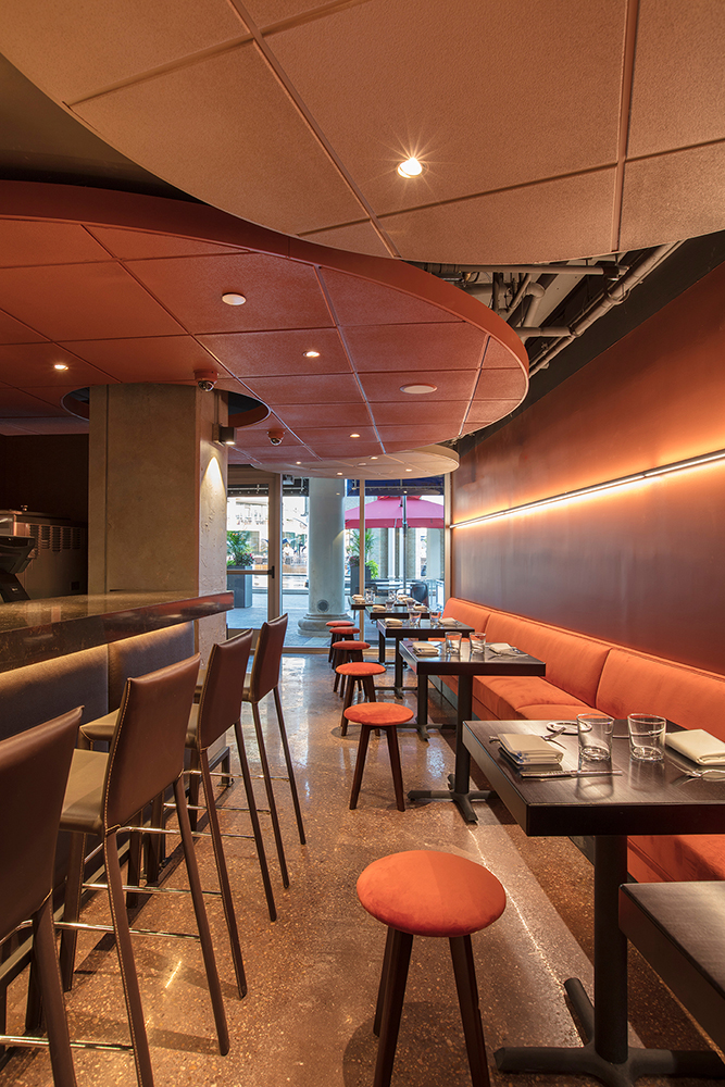
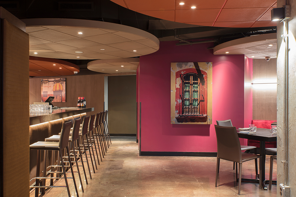
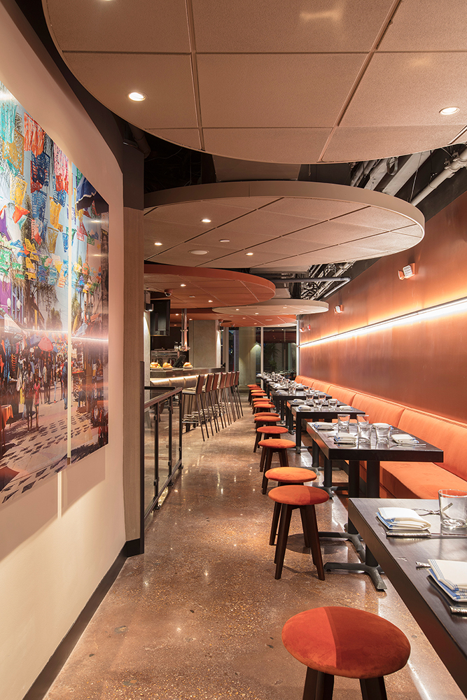
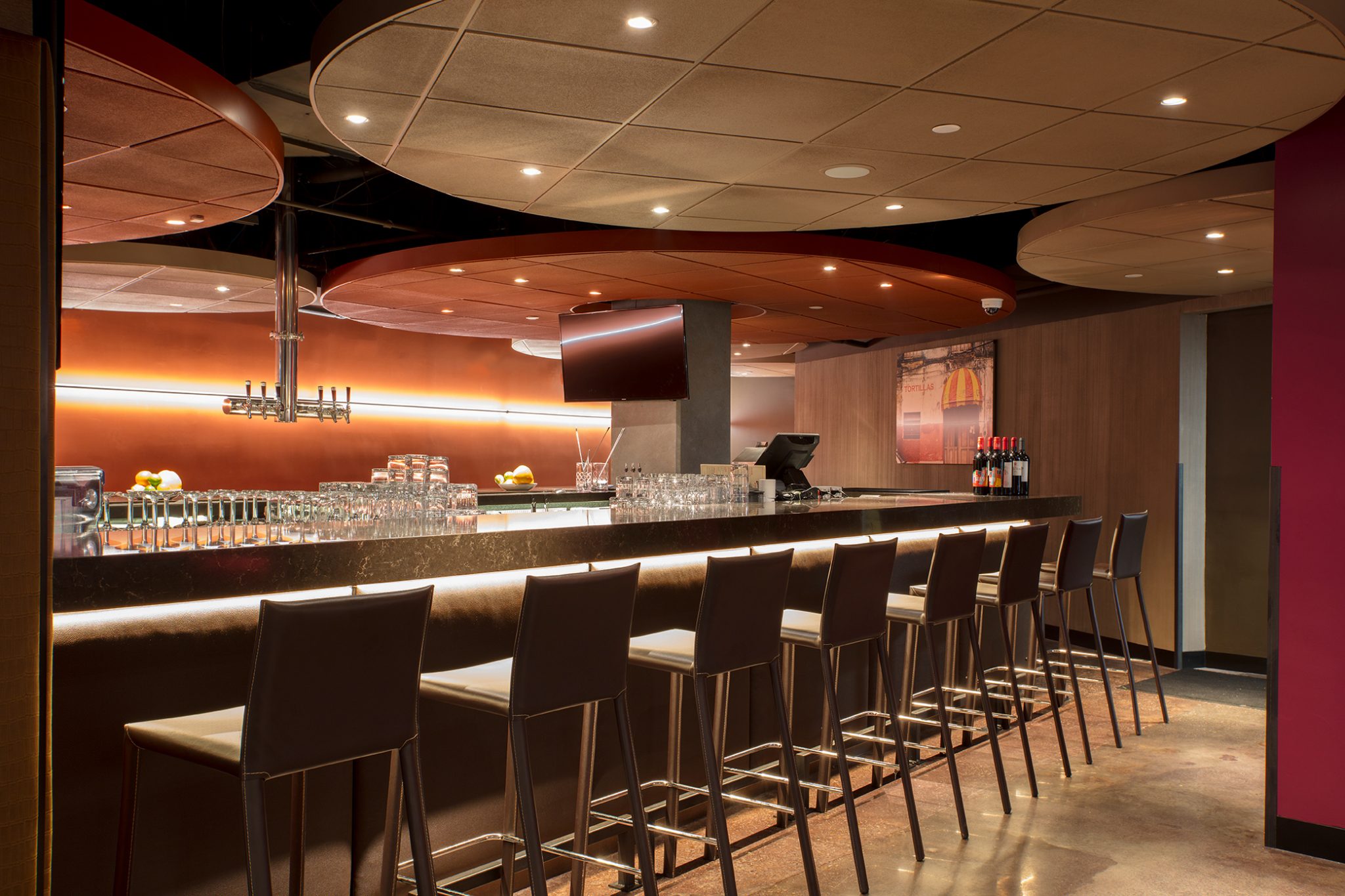
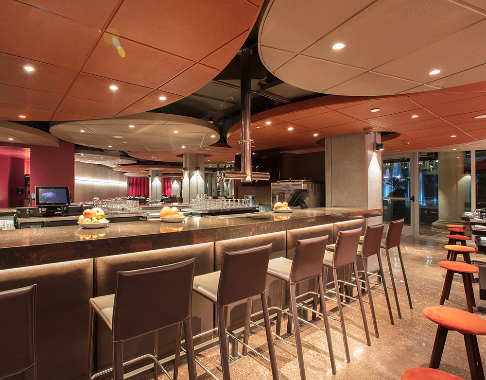
The design of the space emphasizes the ceiling. “Clouds” hover over all of the restaurants. The “clouds” not only bring lots of dynamic energy to the restaurant, they draw the eye up, enhancing the sense of height. Functionally, they provide acoustic attenuation as well as contain the majority of the lighting. Color is used to create separation between the “clouds” and the (abundant) ductwork above it.
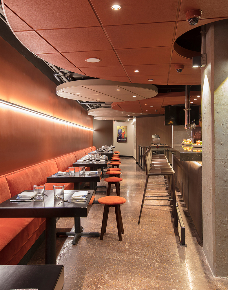
A freestanding bar provides separation between the dining room and the lounge, creating two distinct environments. One end of the bar faces the entry and provides a backdrop to the hostess station. Another side of the bar is next to the kitchen, the bus station, and a tequila cabinet, concentrating ancillary service functions in one location.
A signature element of all the Guapo’s, the tortilla machine, is discreetly placed against the back wall of the restaurant. A troweled concrete finish was applied to this wall to contrast with the openness of the front end of the restaurant.
The use of materials is straightforward, functional and elegant at the same time. The restaurant has many colors: purple, orange and red; emphasizing the different areas of the restaurant. And yet, it is restrained and elegant.
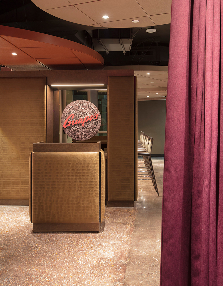
Art is used in key locations and it is where imagery from Mexico and other Latin American countries is used. The Mayan calendar, used as a decorative element throughout the Guapo’s chain, makes an appearance at the entry, as part of the signage behind the hostess station.
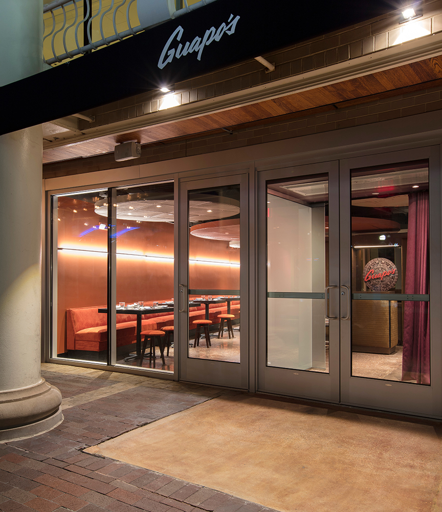
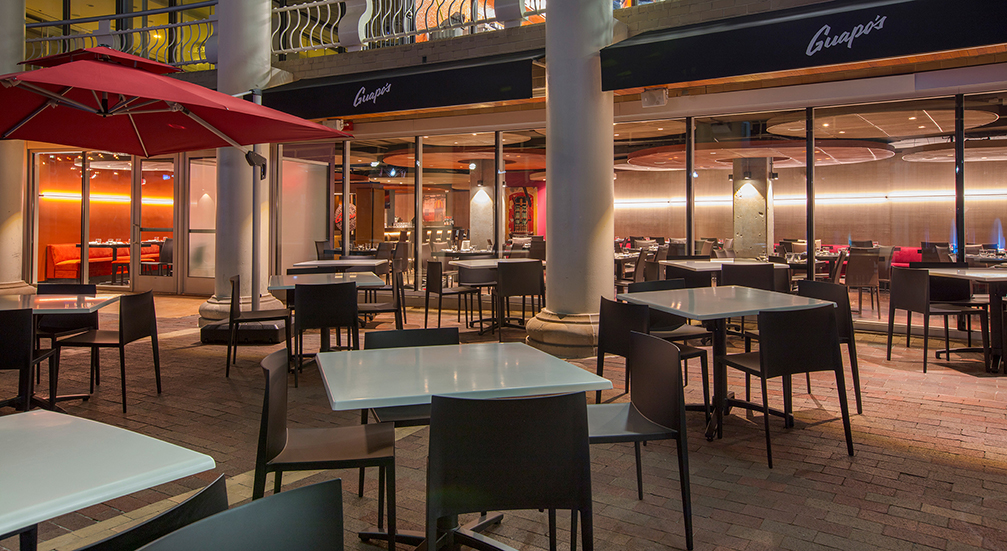
The location of the restaurant, the plaza level of the Washington Harbor in Georgetown was decisive. To that effect, a new glass storefront was installed, which opens up the interior to the monumental fountain directly outside. The outdoor space is another focal point and the layout of the restaurant emphasizes the view of the fountain and plaza. The outdoor seating creates the experience of entering through a courtyard leading to the entry doors. The courtyard is enclosed with low railings and planters with colorful plants and palms.
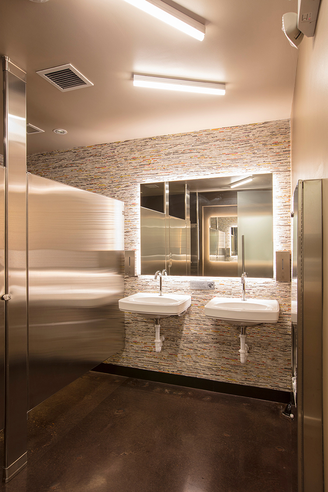
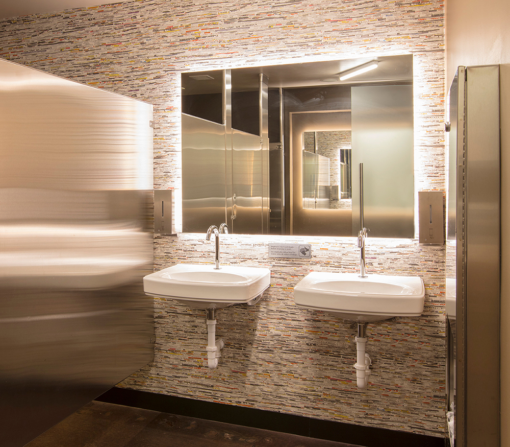
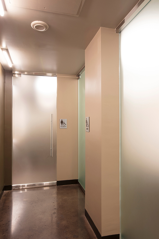
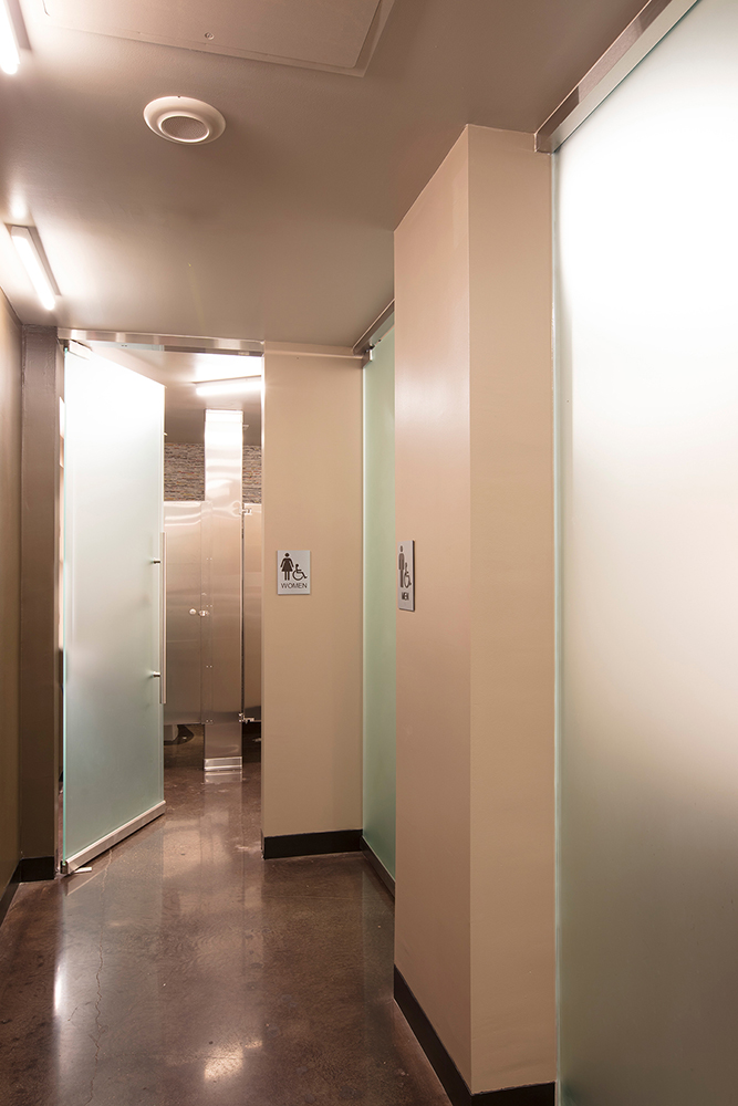
A visit to the restrooms is worth the trek. They are as fun as they are functional.
All of the requirements of a restaurant are provided for in a context of simplicity and understated elegance. Guapo’s of Georgetown not only creates a new brand expression for the restaurants but redefines what a Tex-Mex restaurant is supposed to look like.
