Inside + Out
Dupont Circle Condo Lobby Design
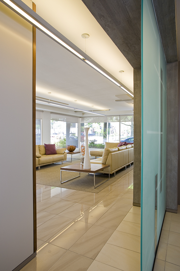
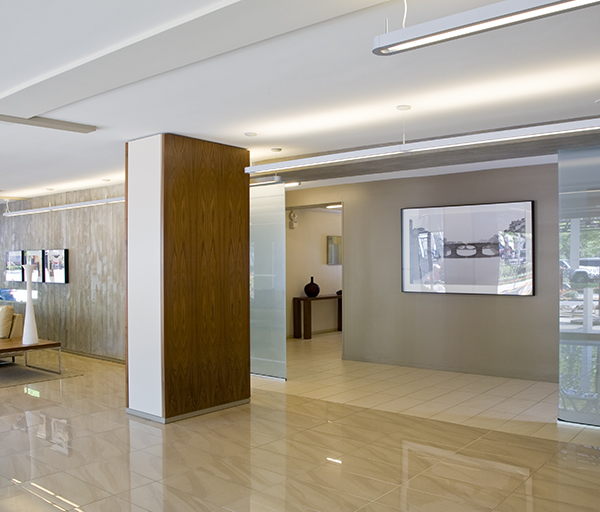
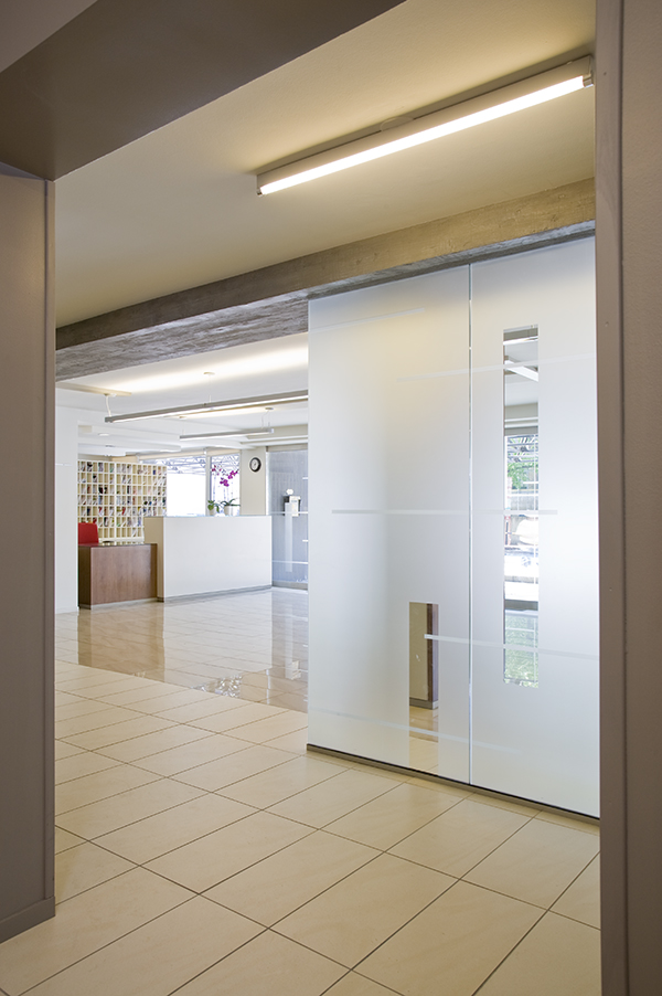
New buildings frequently represent the trends popular during their construction. Condominium buildings, in particular, aim to represent the most popular current aesthetic. Spatial considerations, prevalent technology and market appeal are all factors architects, interior designers and developers take in to consideration.
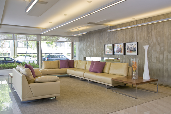
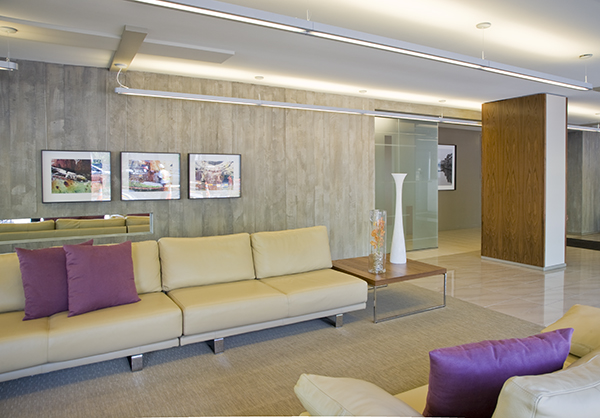
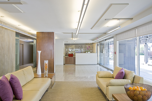
This building, the Dupont East, in Washington, DC’s Dupont Circle neighborhood, is no exception. A 1960’s era building, the lobby was last renovated in the 1980’s. In 2008, when they decided (read, had the funds) to overhaul the space, Ernesto Santalla, PLLC—formerly Studio Santalla—was on hand to help. We interpreted the space in a new, fresh way, in line with this modern era. Our goals were to meet the client’s simple needs, which included direct access to the elevator bank, a new front desk to incorporate all the technologies that had been added over the years and of course, a sitting area.
Our solution is reductive. Take down, open up, remove, rethink and reduce. The lines are simple. The materials must be durable. The colors are neutral. The few furnishings occupy the center of the space. The lighting is natural. Most important, however, is the space faces out, whereas previously it was enclosed, despite the extensive amount of full height windows.
The space is layered in parallel planes, both literal and implied, from the front door to the concrete-finished back wall in the form of walls, the application of materials, ceiling and etched glass patterns and lighting.
We believe the space will stand the test of (a long) time.
Photography by Geoffrey Hodgdon
