Open to the Light | Contemporary Condo
Excerpted From Washington Home & Design Magazine
A Fresh Start: Ernesto Santalla’s bold, innovative design ideas give a Northwest DC condo a new lease on life.
By Julie Sanders; Sept/Oct 2009
Artistic vision comes naturally to architect and designer Ernesto Santalla. Those creative insights became particularly useful back in 2006, when he first glimpsed the plain, one-bedroom condo in Northwest DC that he would ultimately buy. “I liked its quiet, park-like setting,” Santalla recalls. “It presented a clean palette to work on. I could see beyond it to how it could be changed to reflect my lifestyle.”
Built in 1959, the high-rise apartment building once provided student housing for American University; though Santalla’s unit was updated in the early 2000s, the floor plan remained the same. Santalla describes the building’s architecture as “International style,” a modernist aesthetic that developed in the 1920s characterized by simplified lines, a lack of ornamentation and the use of glass and steel. Santalla chose to embrace the architectural roots of the building by adhering to these characteristics even while radically altering the look of the space.
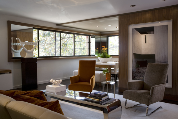
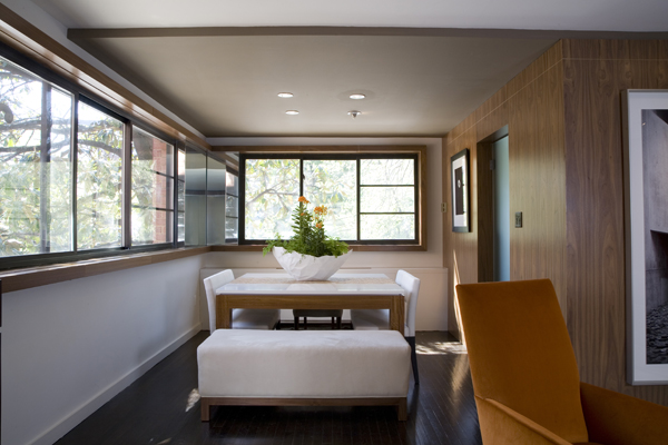
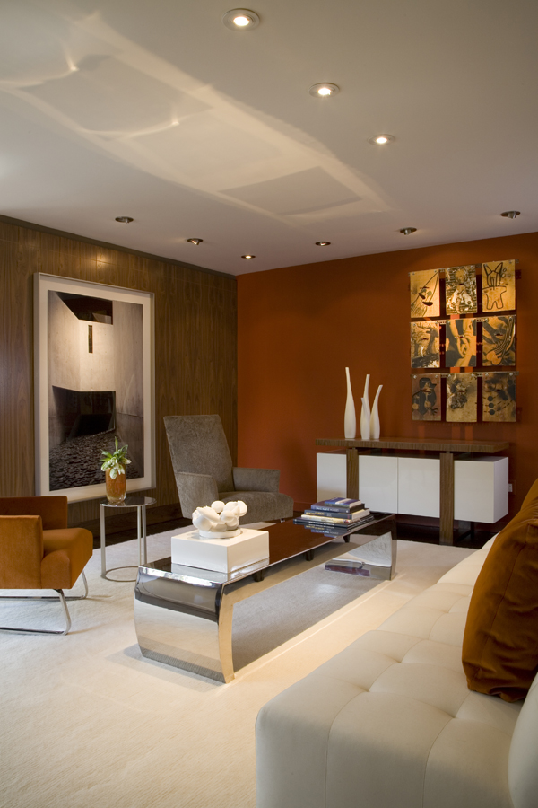
The 900-square-foot apartment includes a living/dining room with an adjoining kitchen, master bedroom and bath. In order to add visual interest and continuity, Santalla used the same dark-taupe paint and walnut millwork, interspersed with a warm white, on selected walls throughout the residence. In the living room, he painted an accent wall a vivid orange-red, and he stained all the apartment’s light oak floors a dark espresso color. In a corner of the dining area, he covered the space between windows with mirrored panels to create the effect of windows going all the way around, a characteristic of the International style. He also installed a mirror at the end of the bank of windows on one wall to create what he calls “the architectural trompe l’oeil effect of extending the windows even further.” Santalla placed a prized sculpture by Washington artist John Dreyfuss in front of the mirror so, as he says, “I can see it from both sides.”
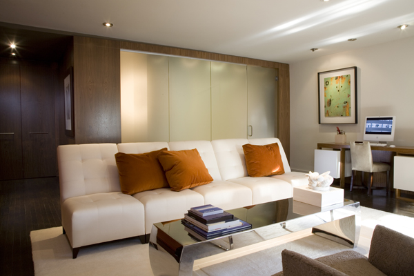
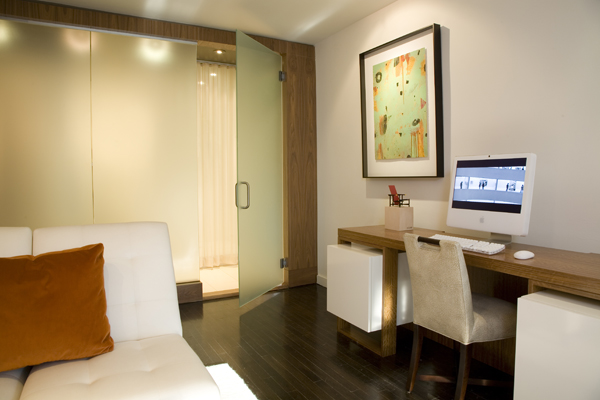
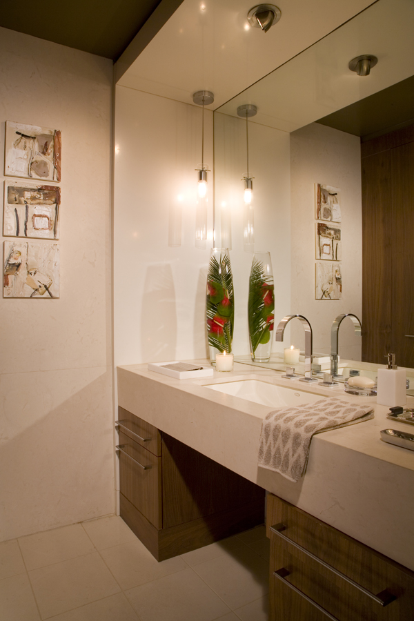
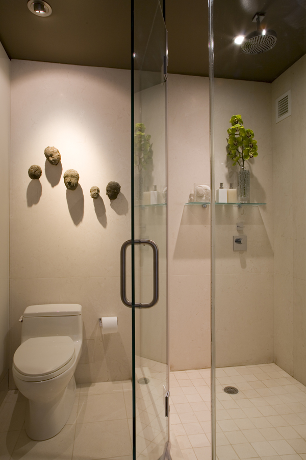
The greatest alteration to the condo, however, occurred in the bathroom and walk-in closet. Originally, the space was piecemeal, dark and cramped. Santalla demolished the walls to create one room; by utilizing part of the front hall closet and reapportioning the area, he was able to construct a spacious combination master bath and dressing room. He replaced the wall between the bathroom and living room with frosted glass, which brings light in from the rest of the apartment but allows for privacy. Creamy limestone used on the floors, walls, shower surround and eight-inch-thick countertops lends the room a sleek continuity.
There was one design conundrum. The only entrance to the bedroom is through the bath, a setup that Santalla found unappealing. “I placed drapes across the shower and toilet so that it feels like you’re entering a foyer,” he explains, adding that he often uses drapes for concealment. The designer also removed the door between the bedroom and bath—but left the doorway—to add a sense of flow between the spaces.
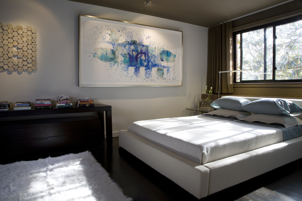
Santalla carried the taupe color scheme and walnut millwork into the bedroom, where he painted two opposing walls and the ceiling to provide a unifying element to the room. Taupe draperies cover the bedroom closet doors and the windows opposite. Below the windows, walnut millwork conceals air conditioning ducts.
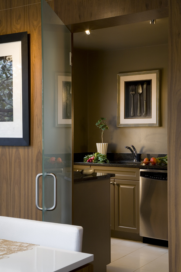
In the main living area, Santalla played with the idea of solid and voided space by enclosing the kitchen completely in walnut yet leaving the adjacent dining area open. He removed the upper cabinetry in the kitchen to make it feel more airy despite its enclosure, and painted it dark taupe. In the dining area, he dropped the ceiling and painted it the color of the kitchen, delineating the space yet leaving it open to the living room.
Santalla’s decorative vision also encompassed furnishings of his own design, including a dining table, credenza and desk on which high-gloss, white-lacquered surfaces rise over a rich African hardwood called Mozambique. “The idea behind the furniture is that it appears to float,” Santalla says of his pieces. In the living room area, comfortable chairs and a sofa by Donghia are grouped around a glass-topped coffee table with a chrome-plated steel base. A plush white wool carpet offers a strong contrast to the nearly black-stained floors. Original fluorescent lights have been replaced throughout with recessed and accent lighting. Against a backdrop of chromatic wall surfaces, an eclectic collection of modern art shows to great effect. Works by Andrés Tremols, sculptor Margaret Boozer, painter Kevin Tillman and others add the finishing touches to Ernesto Santalla’s own expertly rendered palette.
Geoffrey Hodgdon is a Maryland-based photographer.
RENOVATION ARCHITECTURE & INTERIOR DESIGN: Ernesto Santalla, AIA, LEED AP, Ernesto Santalla, PLLC—formerly Studio Santalla—, Washington, DC.

Thank you for your compliments and words of encouragement.