Urbanity

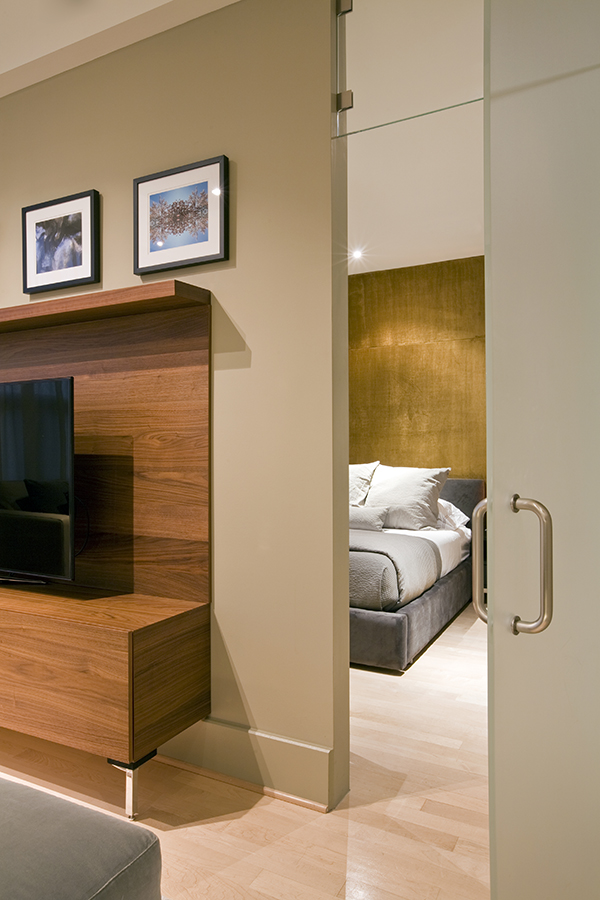
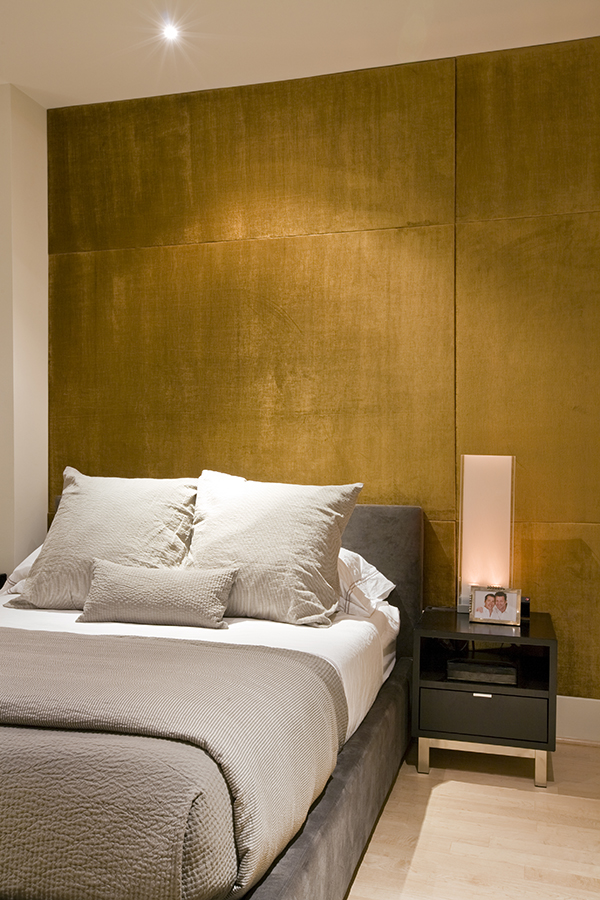
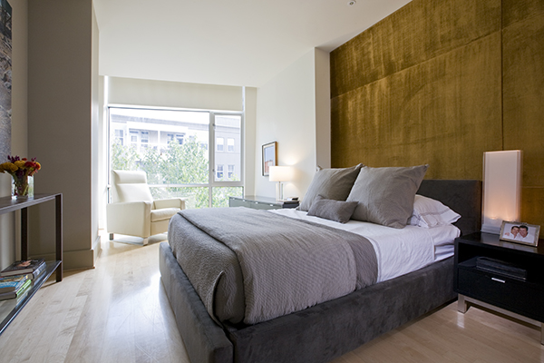
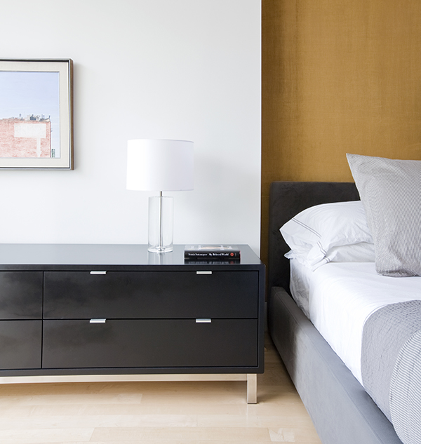
Architecture and Interior Design firm Studio Santalla transformed this open living space in an urban Washington, DC neighborhood. Architecture and Interior Design firm Studio Santalla renovated this contemporary open living space in an urban Washington, DC neighborhood. Architecture and Interior Design firm Studio Santalla combined modern, minimal style with heirloom pieces in an urban Washington, DC neighborhood. Architecture and Interior Design firm Studio Santalla combined modern, minimal style with heirloom pieces in an urban Washington, DC neighborhood.Architecture and Interior Design firm Studio Santalla combined modern, minimal style with heirloom pieces in an urban Washington, DC neighborhood.Frosted glass hides the kitchen from view while providing natural light in this urban apartment by Studio SantallaArchitecture and Interior Design firm Studio Santalla combined a modern leather sectional with heirloom pieces in an urban Washington, DC neighborhood. Washington, DC architecture and interior design firm Studio Santalla utilized frosted glass to take advantage of the natural light in this urban apartment Washington, DC architecture and interior design firm Studio Santalla combined contemporary furniture with soft touches to provide this urban apartment with a sophisticated feel. Upholstered wall panels lend a touch of luxury to this urban apartment renovated by Washington, DC architecture and interior design firm, Studio Santalla Natural light floods this urban, contemporary bedroom by Washington, DC architecture and interior design firm Studio Santalla Upholstered wall panels complete this light-filled contemporary bedroom by Washington, DC firm Studio Santalla

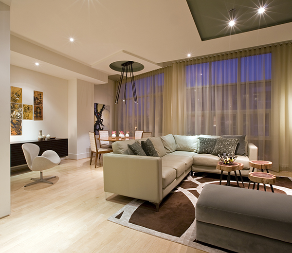
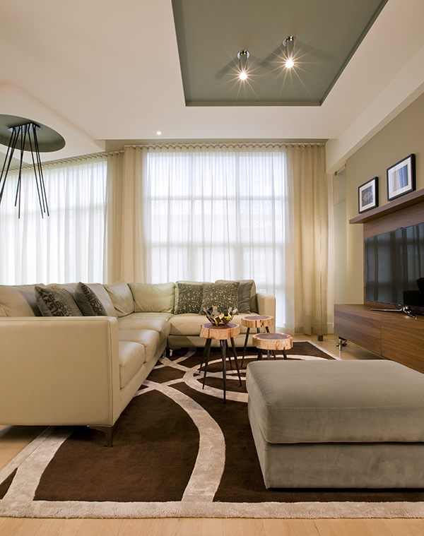
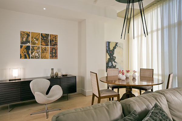
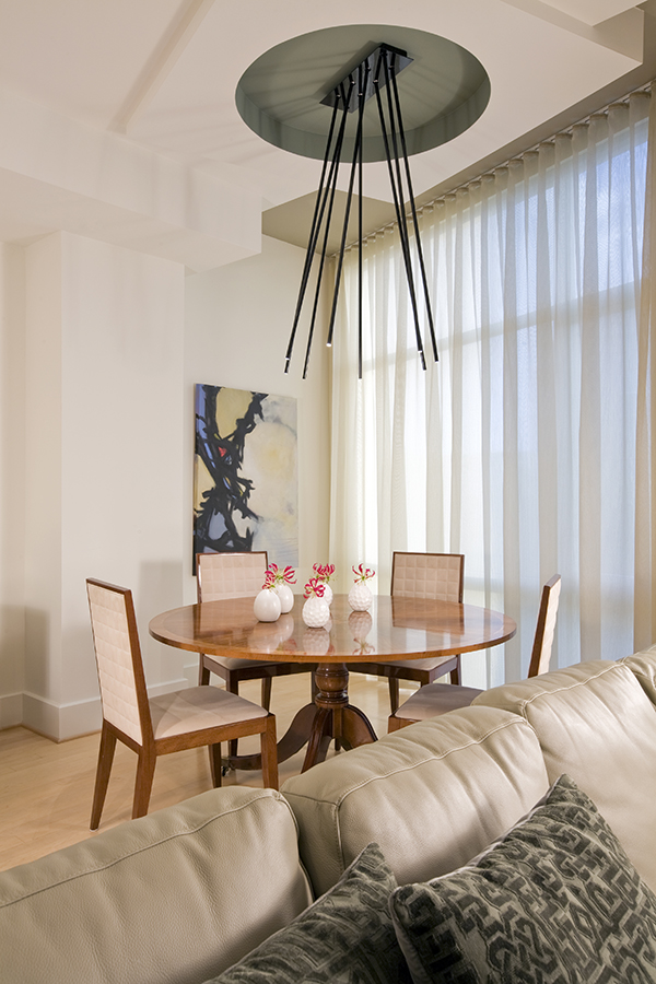
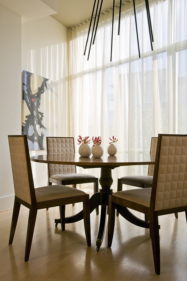
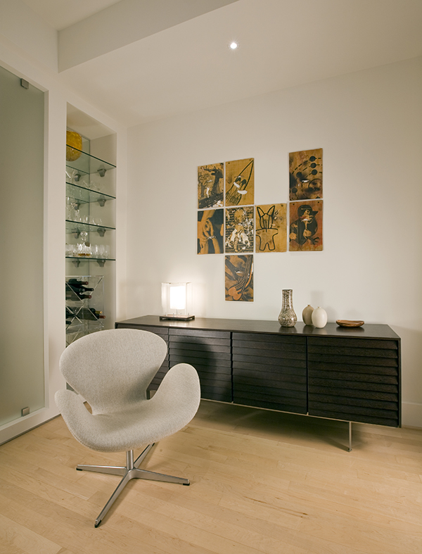
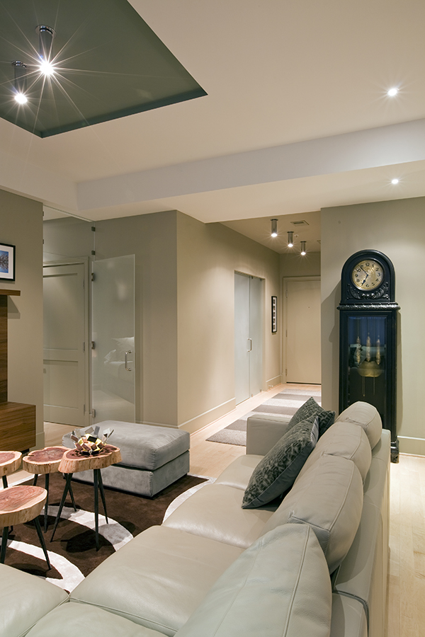
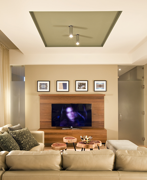
Studio Santalla was approached to create a new home for two Washington, DC professionals wishing to downsize their living space.  The move took them from a row house in Washington’s historic Dupont Circle neighborhood to a two bedroom apartment in the vibrant, urban, up-and-coming U Street Corridor. Our task was to transform a rather plain and generic apartment into a custom, sophisticated space in a few strategic moves.  Ceiling details serve to define functional areas of the living space without creating divisions.  Changing some doors from wood to frosted glass, creates a sense of continuity between spaces, and allows light to travel between spaces.  Lighting was inserted strategically, to enhance certain functions of the home.  The kitchen was partially enclosed with a plane of frosted glass to create visual separation from the main living space while still allowing natural light to filter in from the expansive wall of floor-to-ceiling windows.  Color was used to reinforce the architectural intent and simplify spaces, such as the entry, which as many doors and frames.  Furniture was selected to blend with the client’s collection of heirloom pieces, creating a sophisticated juxtaposition.  Statement pieces like a ceiling light from Viabizzuno create impact while maintaining the visual simplicity of our minimal approach.

Photography by Geoffrey Hodgdon

This project was featured in DC Modern Luxury:

DC Modern Luxury | Grand Nest